trenti.design
Studio founded by the architect Luigi Trenti in 1994 in Firenze, Italy
It deals with Product Design in various sectors, University Teaching and Institutional Roles
Lighting Fixtures since 1992 - Furniture since 1996 - Accessories since 1998
More than thirty awards for design achieved in Italy, Europe, USA and China
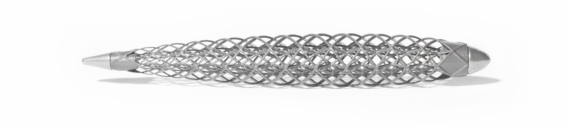
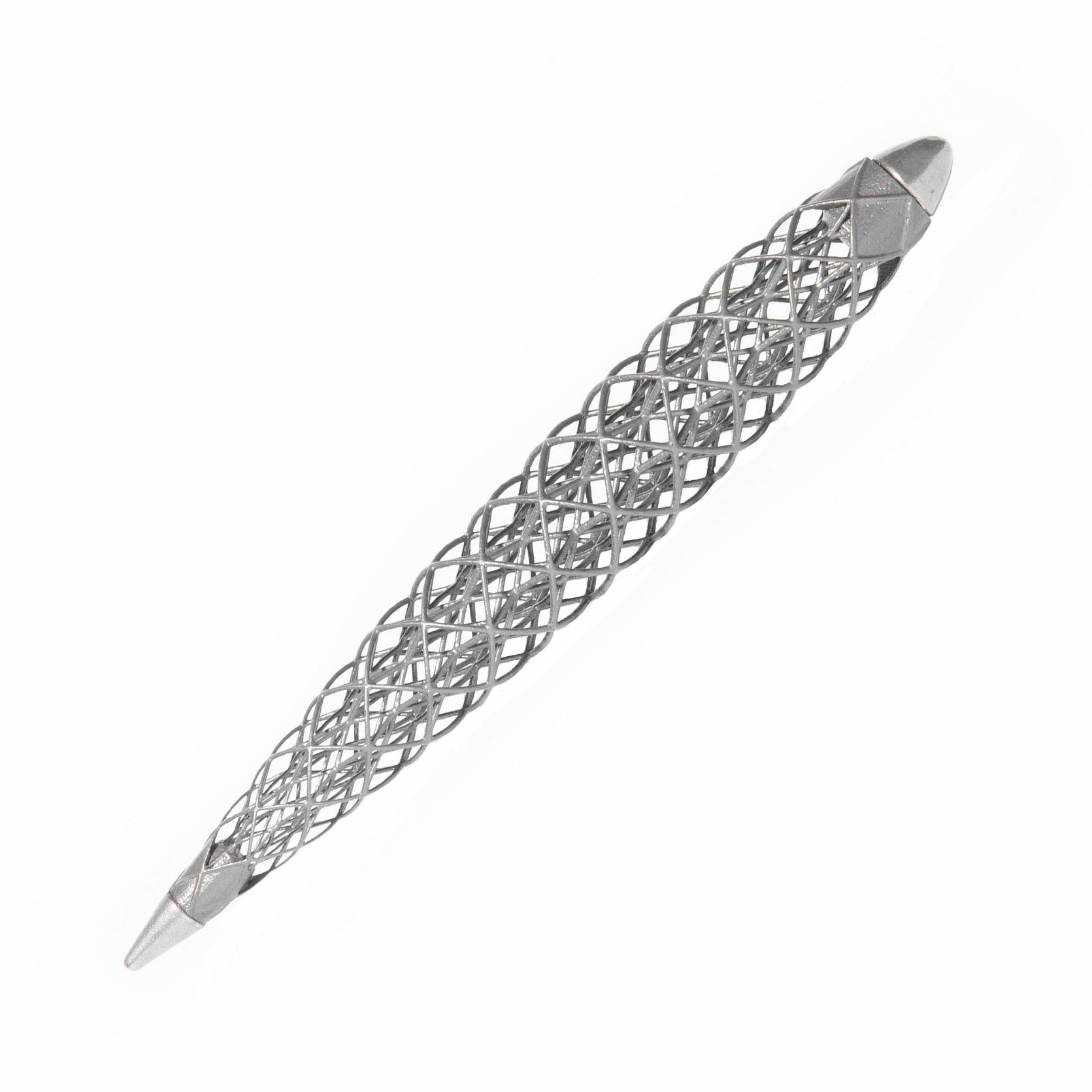
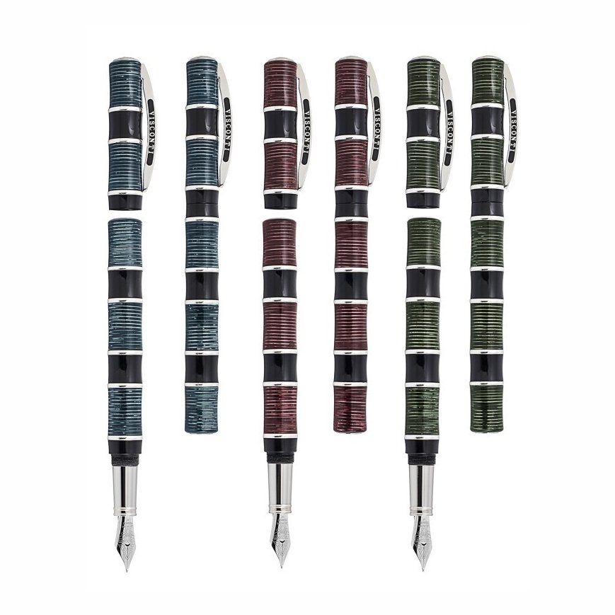
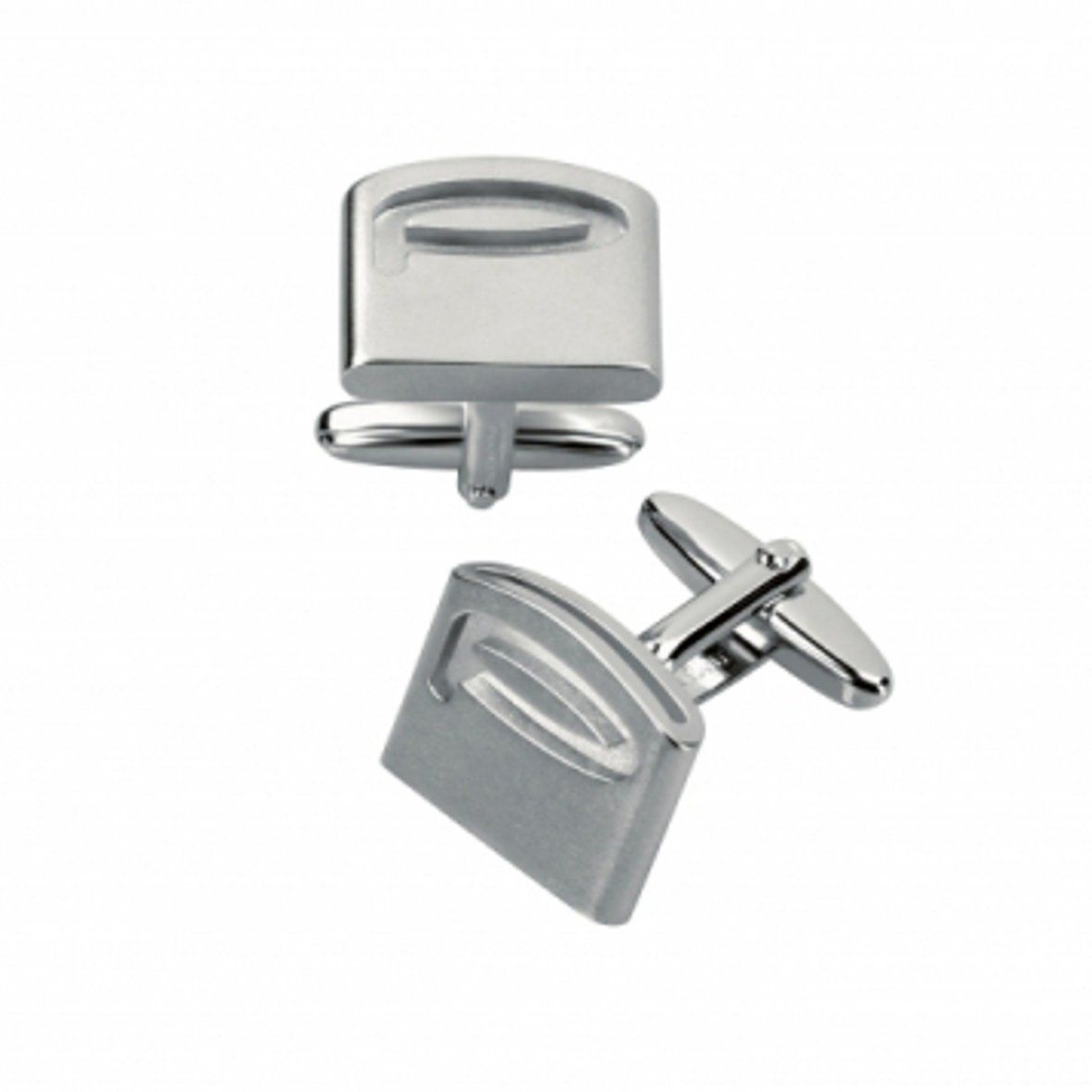
Filum
Design by Luigi Trenti, 2019
For Pininfarina Segno, 2020
The first writing instrument made of titanium by Direct Metal Laser Sintering, is not a pen…
Inspired by the Leonardesque knots also known as "vinciani knots" FILUM is the first product of its kind made completely through "Direct Metal Laser Sintering" which consists in fusing Titanium powder by means of a powerful carbon dioxide laser. Complex circular geometrical interlacing weaves create this masterpiece, the result of the highest level of construction engineering.
The Leonardo’s knots were inspired by the use of flexible twigs of red willows trees, typical of the town of origin of the artist and scientist, to weave baskets or tie the vines.
These weaves then became a sort of signature, a personal emblem that he used everywhere in his jewellery designs, hairstyles, accessories, and in the decoration of the Hall of the Axes in the Castello Sforzesco in Milano.
services
PRODUCT DESIGN
Inventor before designer, some of his particularly innovative products have turned out to be trendsetters replicated by many followers, such as the Lesena lamp, the Poker double-jointed tap, the Server retractable desk, the Egosphere and Jolly pens, the Lift walk-in closet.
He has always been active in various sectors, from lighting to furniture and luxury accessories. Numerous international awards received.
UNIVERSITY TEACHING
Professor of Industrial Design at ISIA of Florence since AA 2008-2009.
The objective of his course is to establish direct contact between students and external partners, preferably productive excellences of the Tuscan territory.
In 2020, as thesis relator, he received the Targa di Merito at the Compasso d'Oro Award in Milan.
He has also teach design courses at IED and LABA.
INSTITUTIONAL ROLES
ADI member from 1993 to 2018, he founded ADI Toscana in 2006 as president and coordinator of the territorial observatory for design until 2010.
In 2012 he conceived the first online design museum, MuDeTo, which he founded as a cultural association in 2013 and of which he is currently president.
Since 2020 he is a member of the Curatorial Board of the Florence Biennale.
works

Lesena
Design by Luigi Trenti, 1994
For Martini Light, 1998
A minimal stylization of the architectural decorative element of the same name.
In 1999 it was selected by Achille Castiglioni for the Intel Prize and exhibited together with products by Sottsass Associati, Jean Michel Wilmotte, Design Group, Foster Associates, Richard Sapper in the center of the Milan fair under the large tensile structure.
In 2000 it won the first prize Young & Design during the Salone del Mobile in Milan. It was then exhibited at La Mia Casa and for a month at the 17th BIO in Ljubljana.
Seen and appreciated by thousands of insiders, in the following years it turned out to be an extraordinary trendsetter, inspiring dozens of products and influencing design in other sectors as well, especially thermo furniture and shower columns, but also mirrors, bookcase modules, TV stands and much more.
Thus was born the very popular typological strand of the Lesena Style.
See also Instagram profile #lostilelesena
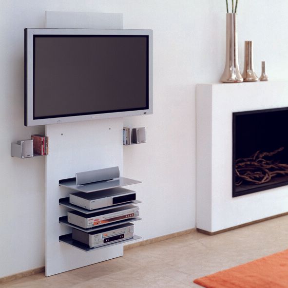
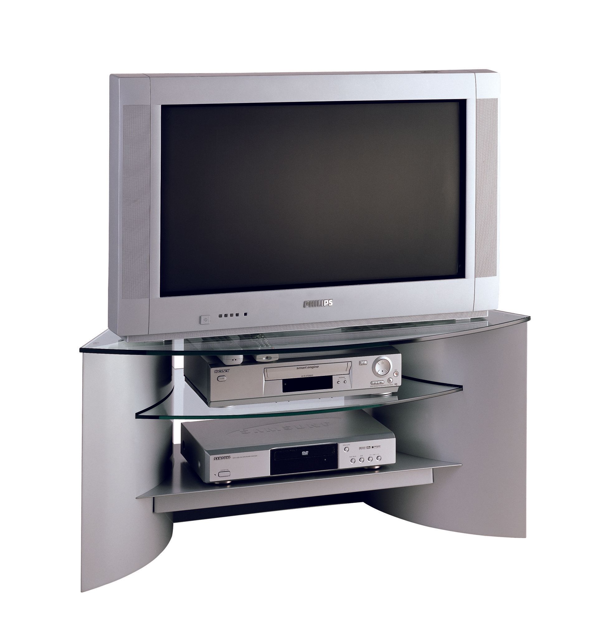
Wall
Design by Luigi Trenti, 2003
For Ciatti Segnali di Casa, 2003
The advertisements that showed the first plasma or LCD screens hanging on the wall were misleading because in order to watch TV or any movie, electrical wiring and connections to peripheral devices are required, thus presupposing previous heavy masonry work. Wall is the closest solution to the idea of a wall-mounted screen.
Its vertical development on the wall allows in a limited space to have an adjustable height of the screen, the housing of up to four peripherals for a complete home-cinema system, the application of side shelves for speakers and DVD storage, all while hiding completely from view any electrical wiring.
The front panel can be purchased in frosted glass or, to camouflage it as much as possible, can be made of MDF tinted like the wall on which it is applied.
Ciatti has been for many years a leading manufacturer in the field of supports for video, computer and hi-fi and even today, after more than ten years, Wall is still in their catalog. In the USA it has been quite successful, distributed through the DWR chain under the name of Muro. In some advertisements it also appeared covered with wallpaper to camouflage it with the wall.
Wall represents the second chapter of the Lesena Style trilogy, which began in 1998 with the Lesena lamp. See also Instagram profile #lostilelesena
Fifty Fifty
Design by Luigi Trenti, 2010
For Cattelan Italia, 2010
Modular bookcase made of lacquered MDF.
For over a decade it has been one of the best sellers in the catalog of Cattelan Italia, renowned Italian furniture manufacturer, distributed worldwide.
The name derives from the fact that the shelves, which are inspired by the design of anechoic chamber coverings, are 50% horizontal and 50% vertical, furthermore each module can be mounted on the wall straight and upside down so that the alternating design of the shelves can be recreated endlessly.
Fifty Fifty represents the third chapter of the Lesena Style trilogy, which began in 1998 with the Lesena lamp.
See also Instagram profile #lostilelesena
Filum
Design by Luigi Trenti, 2019
For Pininfarina Segno, 2020
Inspired by the Leonardesque knots also known as "vinciani knots" Filum is the first product of its kind made completely through "Direct Metal Laser Sintering" which consists in fusing Titanium powder by means of a powerful carbon dioxide laser.
Complex circular geometrical interlacing weaves create this masterpiece, the result of the highest level of construction engineering. The Leonardo’s knots were inspired by the use of flexible twigs of red willows trees, typical of the town of origin of the artist and scientist, to weave baskets or tie the vines. These weaves then became a sort of signature, a personal emblem that he used everywhere in his jewellery designs, hairstyles, accessories, and in the decoration of the Hall of the Axes in the Castello Sforzesco in Milano.
Bugatti Type A
Design by Luigi Trenti, 2005
Prod. Ferrari da Varese For Bugatti, 2005
Bugatti Type A is an evocative limited edition which recalls the classical lines of the Bugatti style, its never ending sinuous lines. The link to the Veyron is only partially direct: the parallel runs along these ideal directives of style, but Bugatti Type A wants to stand out as an independent design, as an eternal recall of the classical Bugatti imprint.
The cap is curved following the classical radius which is manifest or hidden in many details of the Bugatti eternal style, while the clip, set in a game of playing surfaces, redesigns the car's handle. All parts are then treated before being plated: most of them are hand brushed while the others are hand polished to create that slight elegant contrast of different light reflections. The complex barrel design is obtained with an ideal crossing of curved splines, and the lateral polished surfaces sink in the pen's body like hypothetical air intakes following the body of the Veyron. Also the fin in relief on the barrel is taken from the car's line which runs all over it. The sapphire glasses are milled with the same caution and precision used in high-end watch-making in order to obtain a calibrated and invariable housing, and they are tested against temperature
variations which could modify their assets.
To ensure the perfect closure of the cap, and a precise line-up of the different parts, an unusual and advanced bayonet system has been created, made possible by using a stainless steel micro-sphere.
Egosphere
Design by Luigi Trenti, 1999
For F. Pineider, 1999
I had to represent the Pineider tradition, and consequently create important and sophisticated objects of superior quality designed for the socially and culturally evolved consumer. The product had to be closely linked to Tuscan values and atmospheres; there must therefore be an associative link with Tuscany, one of the best-loved regions in the entire world, a cultural landmark and one of the centres of Made in Italy style.
The inspiration came from the Pineider coat of arms which contains two towers with Ghibelline battlements. Anyone has heard about the ancient strife between the Guelphs and the Ghibellines, just as they have heard of one of our most famous sons, the “fugitive Ghibelline” Dante Alighieri, the founding father of Italian literature. Beyond this, the motif of the battlement also encloses in itself a very powerful architectural message, and one which is essential to an effective expression of Tuscanness in a strictly artistic sense. The end part of the lid is therefore a stylisation of the Ghibelline battlement, but also the variegated and imaginative contour of two hills from our splendid Sienese landscape, traversed by the clip, an ideal representation of a river which gushes from its source (the stone on the back) flowing downwards in a slender drop shape. In a world of pens shaped like revolution solids that can be produced with a simple lathe, the differentiated development of the two main sections, harmoniously combined, is original. With Egosphere the concept of "morphing" is introduced, which leads to more articulated volumes that can be produced with multi-axis machining centres. Later, various manufacturers will follow this concept example in the production of writing instruments. In 2001 Egosphere was selected by Michele de Lucchi for publication in The international Design Yearbook.
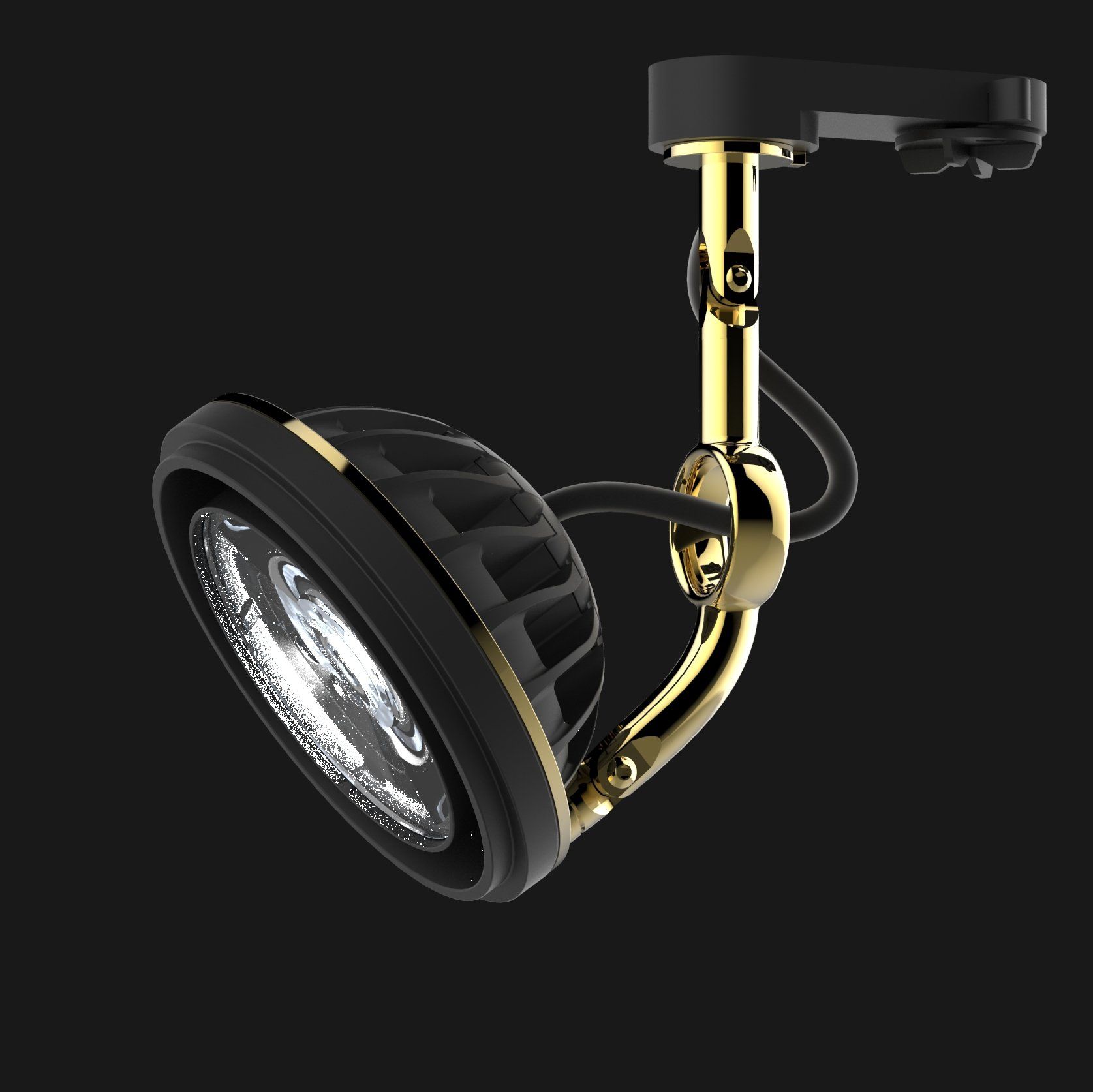
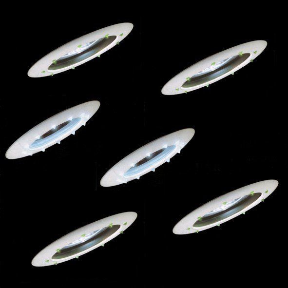
EyeLed Collection
Design by Luigi Trenti + R&D Wiva Group, 2015
For Wiva Group, 2016
With the advent of LEDs, more and more light sources have been redesigned to allow gradual reconditioning of the luminaires in which they are housed.
EyeLED is the LED version of the widespread AR111 halogen source whose shape, developed by Wiva Group R&D staff, allows excellent heat management, thanks to the combined effect of the circular front slit and the rear fins with helical twisting that convey air outwards and promote heat dissipation.
It should be noted that the shape of the fins is clearly inspired by the structural design of Brunelleschi's dome, obviously testifying to a sensitivity and rootedness to the artistic culture of the territory to which the manufacturer belongs, while the connecting arm, with its ring through which the power cord passes, rightly inspired by the eye of the tailor's needle, testifies to the product's vocation for a market that is increasingly customizable in lighting design.
Around this source, with built-in driver, a complete range of models has been defined: from the track versions, to the recessed and trimless ones, to the wall and ceiling lamps and suspensions.
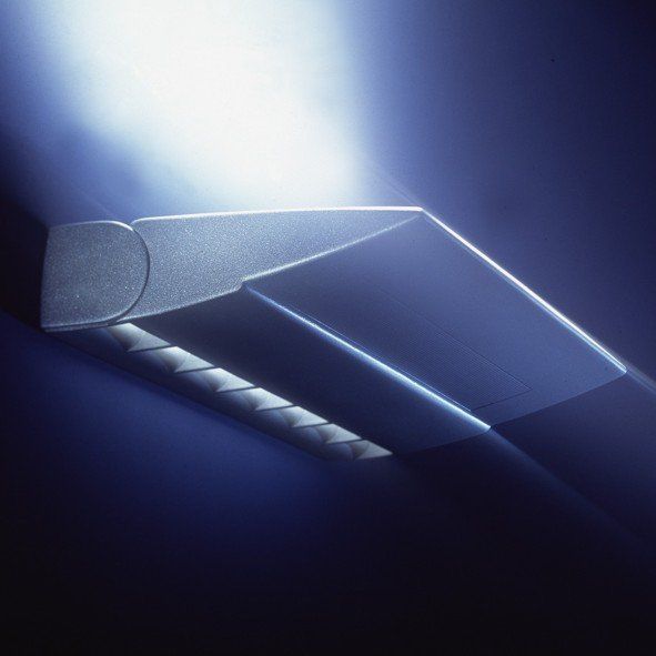
Kono
Design by Luigi Trenti, 2000
For Martini Light, 2000
Initially proposed to GE Lighting and then produced by Martini, this projector was characterized by an unusual irregular truncated cone shape designed to accommodate HDI lamps positioned horizontally in order to have a recessed depth contained within 100 mm. This would have made it the least bulky recessed fixture on the market.
However, the company did not have the courage to go ahead with this solution.
Conventional lamps positioned vertically were adopted and this entailed the addition of an appendage at the top to make room for the lamp holder of the above-mentioned sources.
Kono flanked existing products on the market distinguishing itself only from an aesthetic point of view, in the visible part in extraction, for a different shape than usual.
Subsequently, Martini abusively took over Kono's design to realize street lamps under another signature. The ADI Design Jury ordered Martini to pay a royalty.
But this was nothing more than yet another impropriety on the part of a company that went bankrupt in 2018.
Mondial
Design by R&D Targetti Sankey 1993-1996
For Targetti Sankey, 1996
It is the lucky result of an "in house" design, to the gestation of which have collaborated first Roberto Nesti, then myself as responsible for the design, and finally Gino Cipriani and Piero Landini as designers and Paolo Targetti as producer.
My bolidist and bionic influences are evident in the design of this product, as was the case with the coeval TGE and Arianne, currents of thought that I had been able to assimilate by attending the university both the chair of Prof. Buti, at that time assisted by architects of the caliber of Giovannoni and Venturini, and the chair of Prof. Segoni.
My contribution is then realized in having adopted the same aesthetic concept of the previous project Arianne of which is evident the family feeling, that is to say rounded shapes characterized by elliptical sections, which will be confirmed until the drafting of subsequent drawings made in the technical office.
The Mondial constituted the main lighting fixture of the F1 system, winner in 1998 of the XVIII° Compasso d'Oro Award.
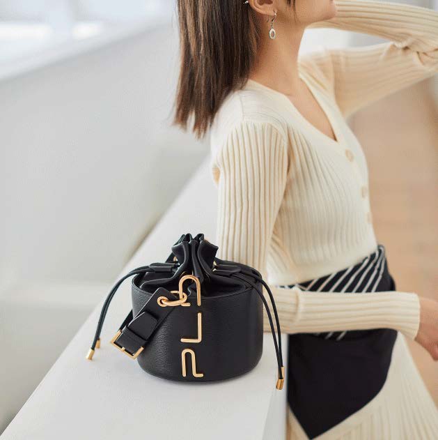
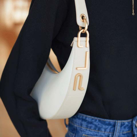
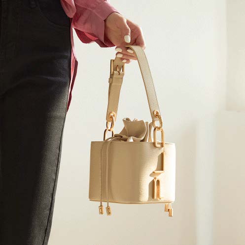
Ikon
Design by Luigi Trenti +
Studio Turchi Firenze, 2020
For PLD, 2021
PLD Collection SS21 model IKON.
The PLD logo has been completely redesigned and becomes a strong and obvious element of communication, functional to the use of the shoulder strap.
The collaboration with this Chinese trade mark is focused on the development of a high level leather goods product made in China, but designed in Italy.
For this brand we made material researches according to updated fashion trends and then design and conceive complete Ladie’s leather goods collections.
If needed, and specifcally requested by the client our studio also undertakes product development of the samples selected, in order to realize the best "samples" for Chinese production.
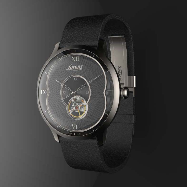
80°
Design by Luigi Trenti, 2013
For Lorenz, 2013
In 2014, Lorenz would celebrate its 80th anniversary and was intention creating a new celebratory model, an automatic equipped with a Soprod A 10-2 BV movement with a visible balance.
The brief called for a classic watch with a sophisticated and innovative design.
My proposal called for a large case to reinterpret the simple and elegant design of vintage watches with fluid and decisive geometries. The surfaces of the sapphire crystal, the bezel and the lugs were pleasantly joined together without any solution of continuity, while the thin lateral thickness of the case transmitted a feeling of lightness and essentiality. The dial, articulated on three levels, communicated with superimposed representation the anniversary numerals, with the number eight, always considered auspicious, represented through the intersection of two ellipses. The small seconds dial, deliberately placed in the center, created a pleasant geometric motif by intersecting the asymmetrical window that highlighted the movement of the balance. The three levels of the dial had sculpted surfaces with threedimensional concentric profiles and guilloché engraving. The caseback was fitted with a transparent sapphire crystal, through which it was possible to have an even more complete view of the Soprod calibre.
The concept was approved, but the change in Lorenz's corporate structure in 2014 put the celebrations on the back burner and interrupted the production development of the project, which was never realized again.
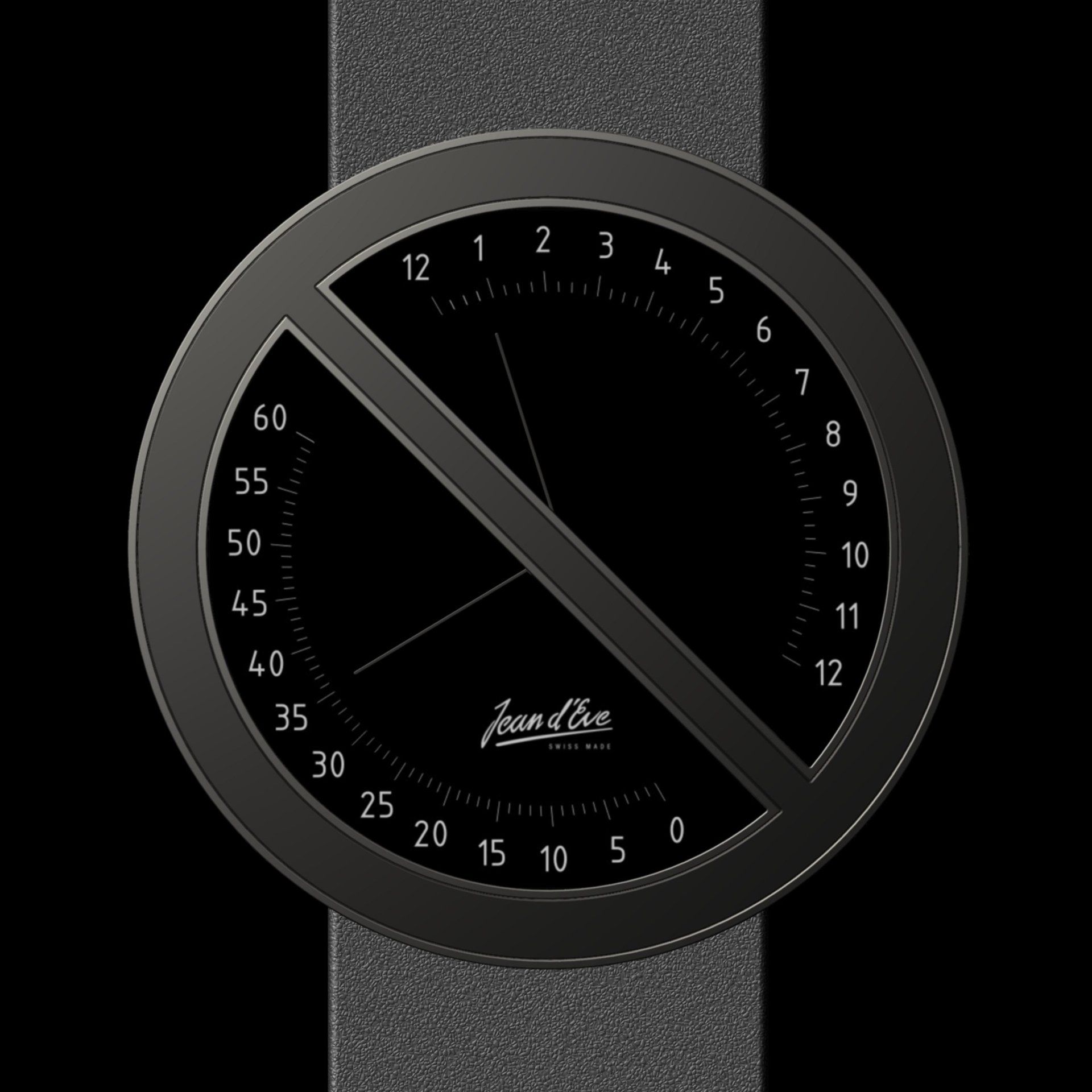
Don't Stop!
Design by Luigi Trenti, 2012
For Jean d'Eve, 2012
Concept for wristwatches whose case design draws inspiration from the graphics of no-parking road signs.
The resulting division of the dial makes it possible to separate the various hour and minute readings and, whenever possible, the date and power reserve.
In reality, it is possible to think of countless layouts that adapt to this concept, adding or removing other features and complications.
This concept of a watch was initially proposed to the company Jean d'Eve because it was considered the ideal customer as it produced various models with retrograde mechanisms and later also to Lorenz, Locman and finally Alessi, who appreciated the design and would have liked to realize it, but did not find the availability of their manufacturer Citizen.
Deposited in ADI Project Register Protocol Number RP2630.
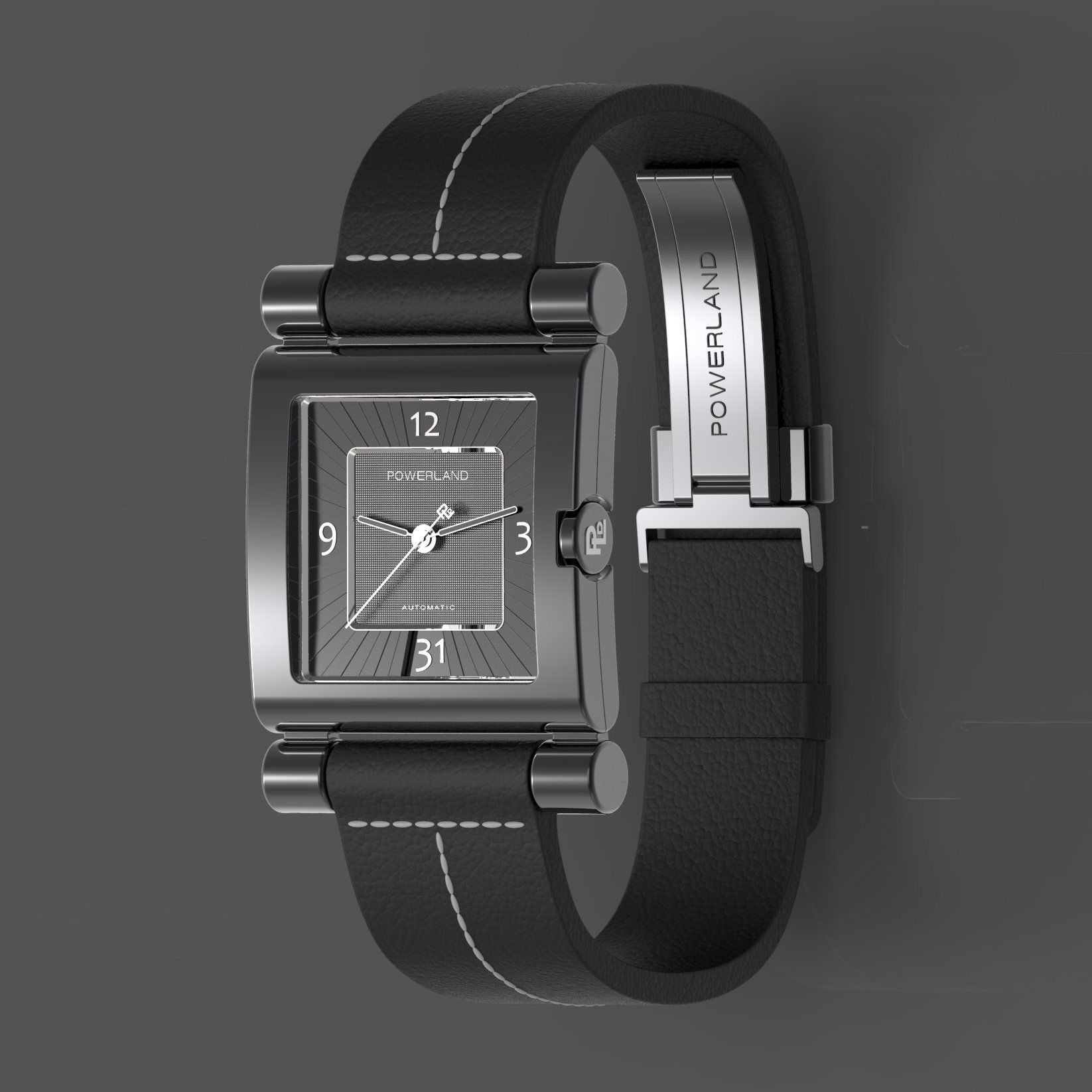
San Paolo
Design Luigi Trenti, 2016
For Powerland, 2016
Founded in 1970, the Powerland (now PLD) brand has been run for several generations by the founding family over the course of half a century. The brand is the result of the efforts of generations of artisans and since the first embossed leather collection, PLD products have been sought after by celebrities from all walks of life for many years in China. From year to year, the brand has continued to extend its connotations of P="Posh", L="Legendary" and D="Distinguished".
The concepts developed for the watches play on the characteristic elements of the Chinese brand.
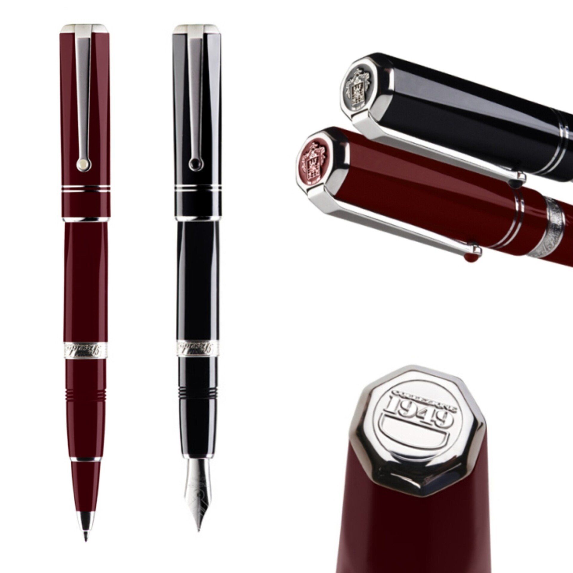
Nuova 1949
Design by Luigi Trenti, 2008
For F.Pineider, 2012
The concept of morphing that I introduced in 1999 with the cap of model Egosphere, become the institutional Pineider pen, had a further confirmation with the Bugatti Type A, and returns in this model of pen which wants to be a new edition of the Model Collection 1949 of the 90's.
At the ends of the body and of the cap, the volumes start faceted and thanks to the morphing, gradually assume a circular cross section.
The realization of the product, which I have not been able to follow, betrayed the initial design of which is still preserved the overall concept, as a signature of the Trenti design style.
Jolly
Design by Luigi Trenti, 2003
For F. Pineider, 2003
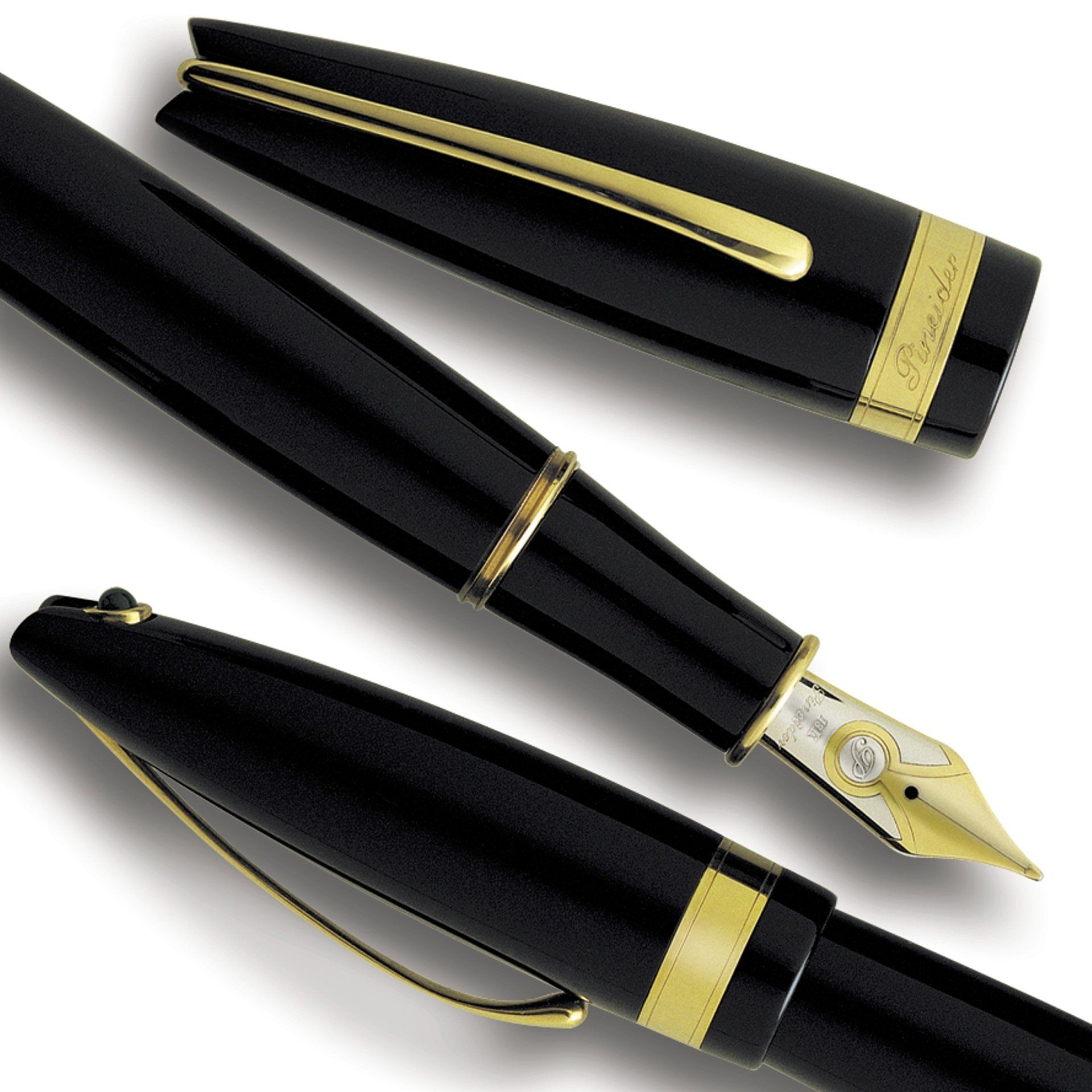
Leather pens have always been made by sticking through gluing the covering on the outer surface of a tube taking care that the ends of the covering itself perfectly fit together. In spite of the evolved productive technology used, this joint, which should be invisible, can be easily seen with the naked eye. Instead of hiding it, I have therefore thought to highlight it by turning it into the typical element of the product. Through special equipment the two ends are sewn together directly on the tube, creating a jutting rib run through by a nice stitching. The geometry of the section created by the shank covered with leather extends as far as the whole volume of the pen.
On the cap, where the Pineider coat of arms is engraved, the rib turns into a clip and so it can be wheeled in order to allow the insertion in the breast pocket. The close and essential line modulated through sharp geometries is set against the use, as per the covering, of a material (the leather) and its workings (the stitching), always tradition and cultural and economic heritage of the Florentine area to which Pineider has been bound back since 1774, year of its foundation. The jutting rib created by the two ends sewn together represents a spontaneous ergonomic element which improves the grip of the writing instrument and has another important function: it stops the pen from rolling down, when you put it on an inclined plane. In the end, leather pens at present on the market have unremovable coverings, so when they get ruined they have to be thrown away. On the other hand, with Jolly you can change the covering when it is spoiled or if you prefer, you can just change the colour. Shortly after its release and publication in magazines, several manufacturers proposed leather-covered pens, and Montblanc put on the market the Bohème in leather. In the last decade it has certainly been the pen that has received the most recognition for design, having been acquired in the permanent collection of the Museum of Modern Art in Chicago, exhibited at the BIO in Ljubljana, published on the ADI Design Index and selected for the iF in Hannover, Grandesign Etico and Design Preis.
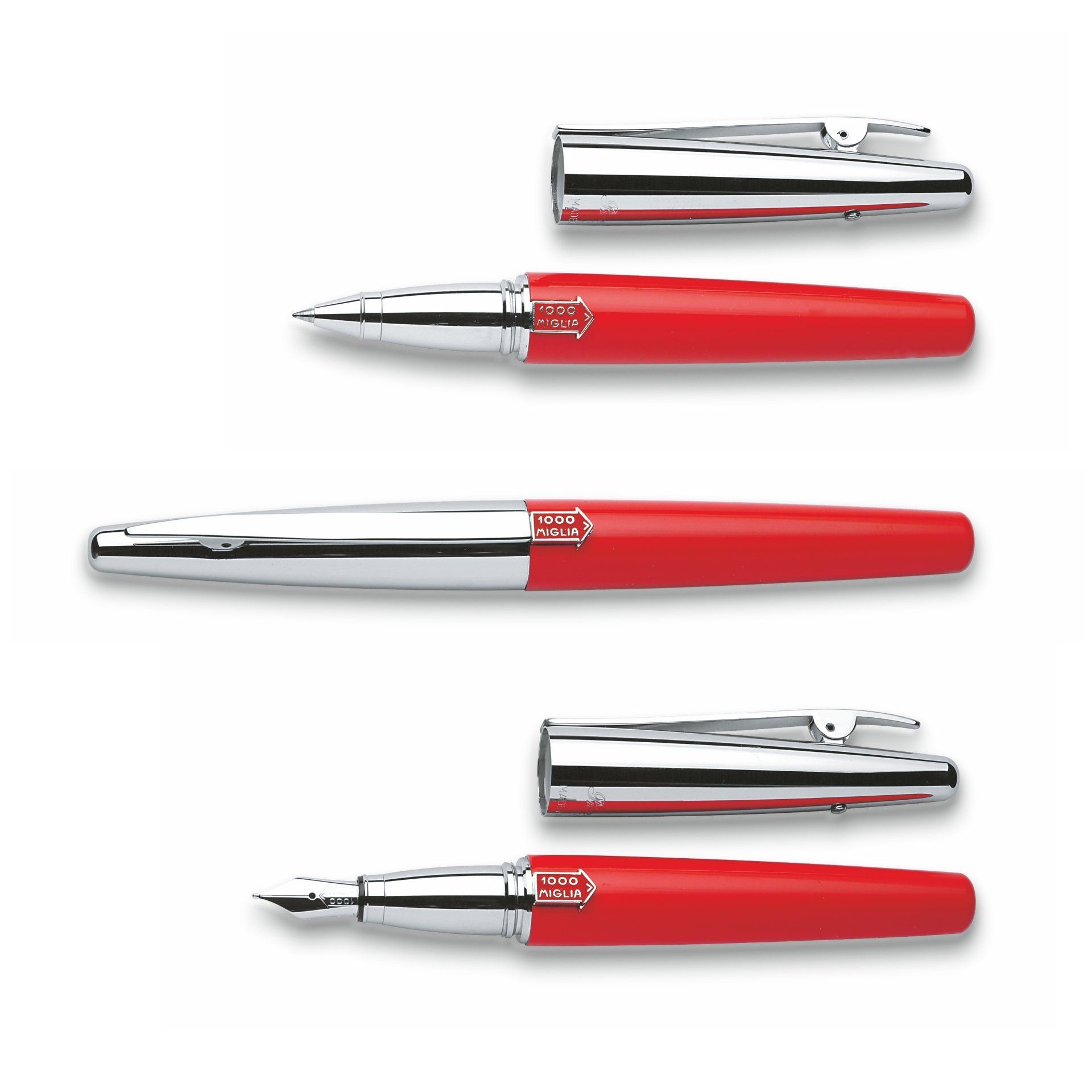
N°4
Design by Luigi Trenti, 2003
For 1000Miglia, 2003
In the collective imagination, the 1000 Miglia race evokes figures of vintage sports cars with bright and elegant bodyworks. On these four-wheeled gems the sports temperament was kindly emphasised by the coachbuilders at that time, by adding thin mouldings and chromium-plated longitudinal profiles.
In the 1000 Miglia pen, if we take into consideration the shank as an ideal bodywork, the clip represents a sculpturesque and streamlined profile that goes to the centre: it represents the race course that from Brescia goes to Rome, geographically located in the centre of Italy. At one end it is jutting in order to allow the lifting, at the other end it gradually widens out as far as it geometrically rejoins the dimensions of the official logo, the red arrow made of enamel, fixed on the shank of the pen enamelled in red as the racing Ferrari or Alfa Romeo cars. The logo in relief stops the pen from rolling down when you put it on an inclined plane. Modified geometric proportions amongst clip, cap and shank mark out this pen. The cap is bigger lengthways and this produces two singular effects: when you unscrew the cap, the pen assumes a more compact and handier image; when, instead, you put the cap on the bottom, the pen assumes important proportions.

Mask
Design by Luigi Trenti, 2006
For Cisal, 2006
It is the reinterpretation of the ancient water masks in a modern way.
Their function was to decorate a source of water flowing from the wall, or from a fountain, by covering its erogator pipe.
The reinterpretation of this theme has led me to define forms that recover the setting and functionality of those objects, but with a contemporary image, inspired by the symbols that are now part of the collective imagination, used in the communication.
It is the recovery of a traditional element reinterpreted in a playful and intriguing way.
The water masks become curious presences within the domestic environment, protagonists of a design operation that reinforces the functional aspect of each decorative element.
The rotation of the controls for hot or cold water, determines the change of expression of the mask-tap.
It's easy to imagine the nice effect it can have both on an adult public and on young and very young users (children who like to take a bath, for example...).
Deposited in ADI Project Register Protocol Number RP1393.
Warning!
Design by Luigi Trenti, 2018
For RCR Cristalleria Italiana, 2018
At first glance it resembles a classic decoration. On closer inspection it is a geometric design that reveals a symbolic message to invite everyone to drink alcohol in a more responsible way. With the usual great mastery of RCR in the decoration of the @Luxion by grinding, we have succeeded in representing a very topical issue that is alcohol consumption in a more responsible way. The theme is expressed through graphics that are anything but shocking or revolutionary, but absolutely in line with the decorative tradition of glassware for which the company has always been renowned in the market.
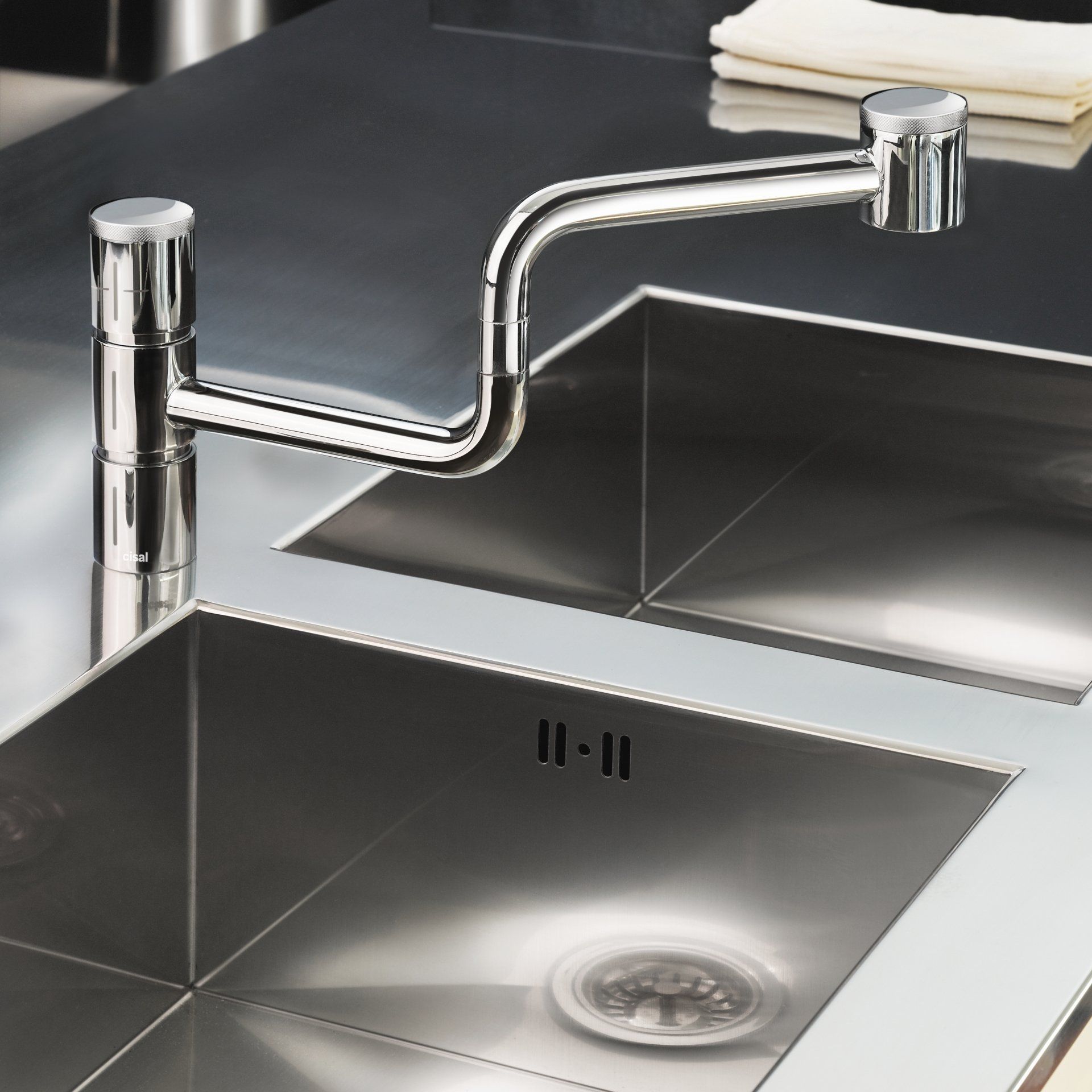
Poker
Design by Luigi Trenti, 2002
For Cisal, 2005
It was the first double-jointed tap for kitchen tops, ID Award in New York, Yatao Award in Guangzhou in 2007 and Nominee for Design Preis Deutschland in 2009.
Born as an alternative to large spring taps, it is based on a joint that is widely used in the field of lighting.
The name has been taken from the 4 identical superimposed cylinders with different functions. Base, joint, control and jet breaker. When closed it looks like a very unusual sculpture: when open it can easily reach the entire work surface around the sink. Sponges can be left to dry on the tubes.
In production since 2005 it was a trendsetter and has been later imitated and replicated by many other manufacturers around the world.
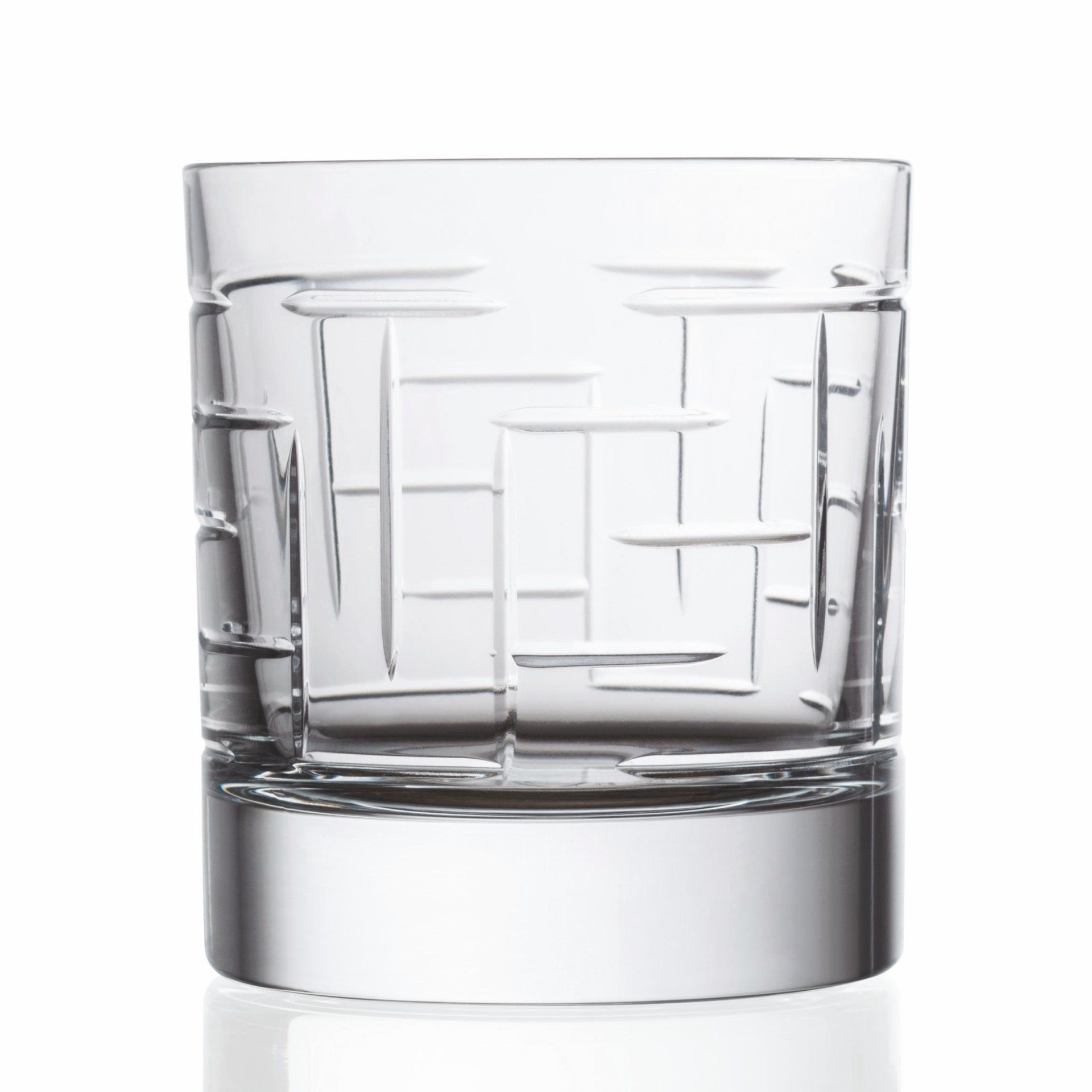
Labyrinth
Design by Luigi Trenti, 2018
For RCR Cristalleria Italiana, 2018
It is the mirror of our life, which reserves to all mysterious forks in the road, uncertain paths and sometimes blind alleys, a divine design, at the same time simple and complex to play at losing oneself and finding oneself tasting one's favorite drink.
With the usual great mastery of RCR in the decoration of the @Luxion by grinding, we have succeeded in representing a very topical issue that is alcohol consumption in a more responsible way. The theme is expressed through graphics that are anything but shocking or revolutionary, but absolutely in line with the decorative tradition of glassware for which the company has always been renowned in the market.
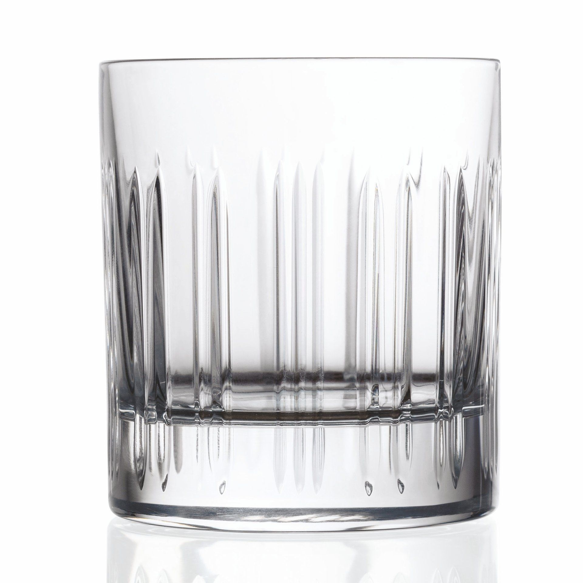
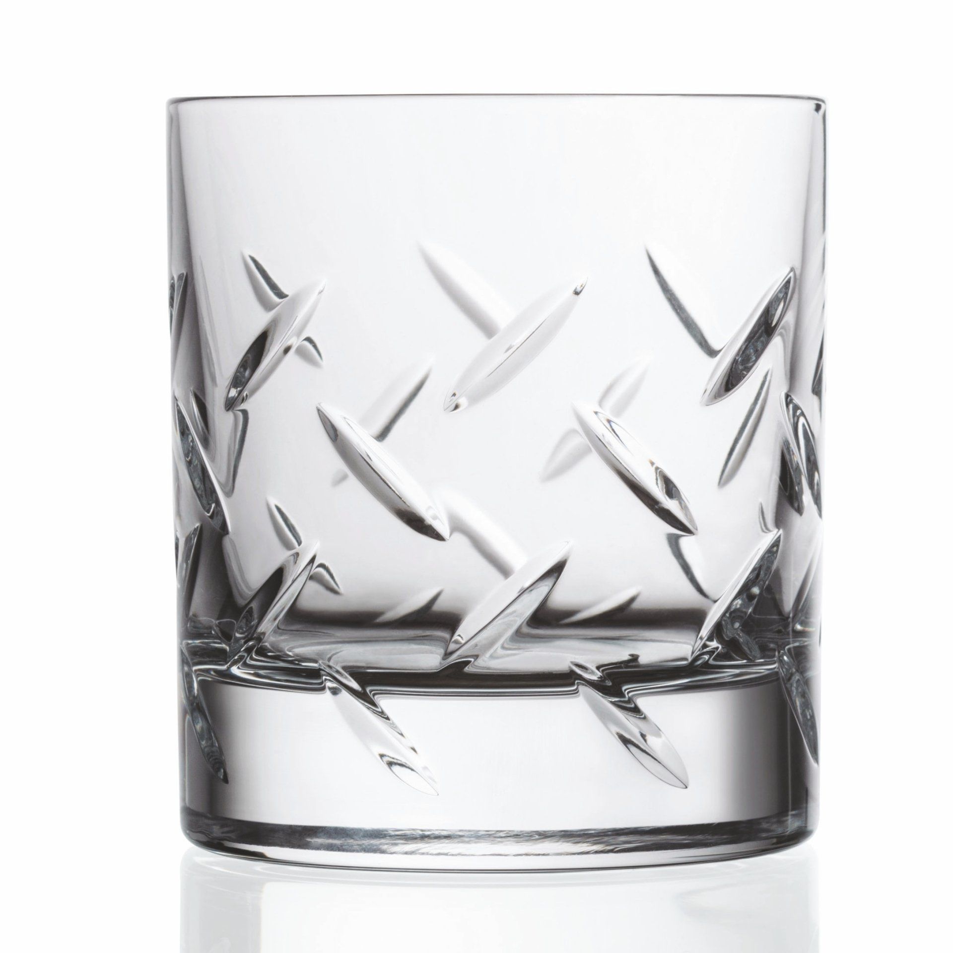
Barcode
Design by Luigi Trenti, 2018
For RCR Cristalleria Italiana, 2018
While in the past, on certain historical glasses it was the analog fingerprint that determined the design of an effective handle, now, only a sequence of spaces and bars can adequately represent the ubiquitous digital contemporary.
With the usual great mastery of RCR in the decoration of the @Luxion by grinding, we have succeeded in representing a very topical issue that is alcohol consumption in a more responsible way. The theme is expressed through graphics that are anything but shocking or revolutionary, but absolutely in line with the decorative tradition of glassware for which the company has always been renowned in the market.
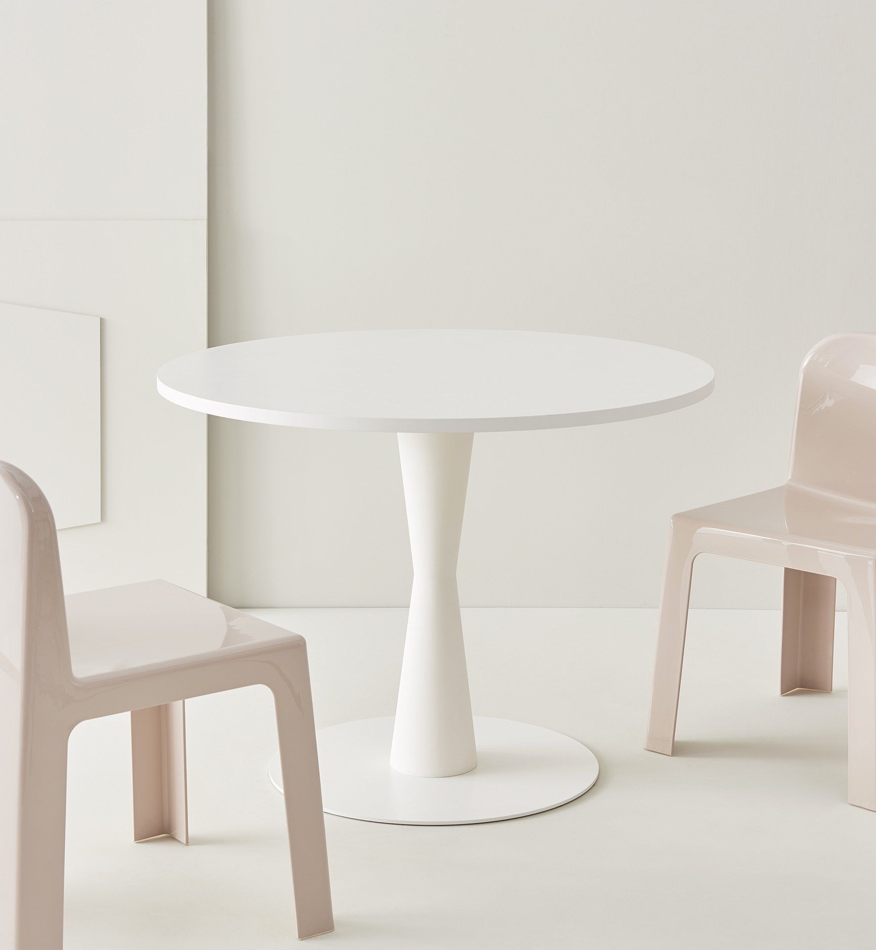
Coni
Design by Luigi Trenti, 2013
For Segis, 2013
Segis in the world is a leading company in the design and production of innovative and high quality seating for the Contract industry.
The company was born in Italy in 1983 in Poggibonsi, a town with an ancient history and tradition of furniture production, near Siena.
Inspired by the shapes of the artist Fausto Melotti's vases of the 50s, many years before meeting Segis I had imagined a bistro table that could be disassembled and stacked to solve the problem of storage in a small space of bar tables.
I have the documentation of a table named LT19 with this shape that I had studied, planned and prototyped with Casprini Gruppo Industriale in 1996.
By the company's desire, it was then made in a simpler version, with a monobloc base that cannot be disassembled, made of polypropylene with rotational molding.
In the years that followed, the theme of the truncated cone as a base for tables became a fashion in furniture and there were many companies that proposed similar ideas.
Steel
Design by Luigi Trenti, 2018
For RCR Cristalleria Italiana, 2018
The high alcohol content of the drinks is gently communicated through the representation of the shape of the grains arranged to create the typical pattern of the sturdy and embossed metal sheets.
With the usual great mastery of RCR in the decoration of the @Luxion by grinding, we have succeeded in representing a very topical issue that is alcohol consumption in a more responsible way. The theme is expressed through graphics that are anything but shocking or revolutionary, but absolutely in line with the decorative tradition of glassware for which the company has always been renowned in the market.
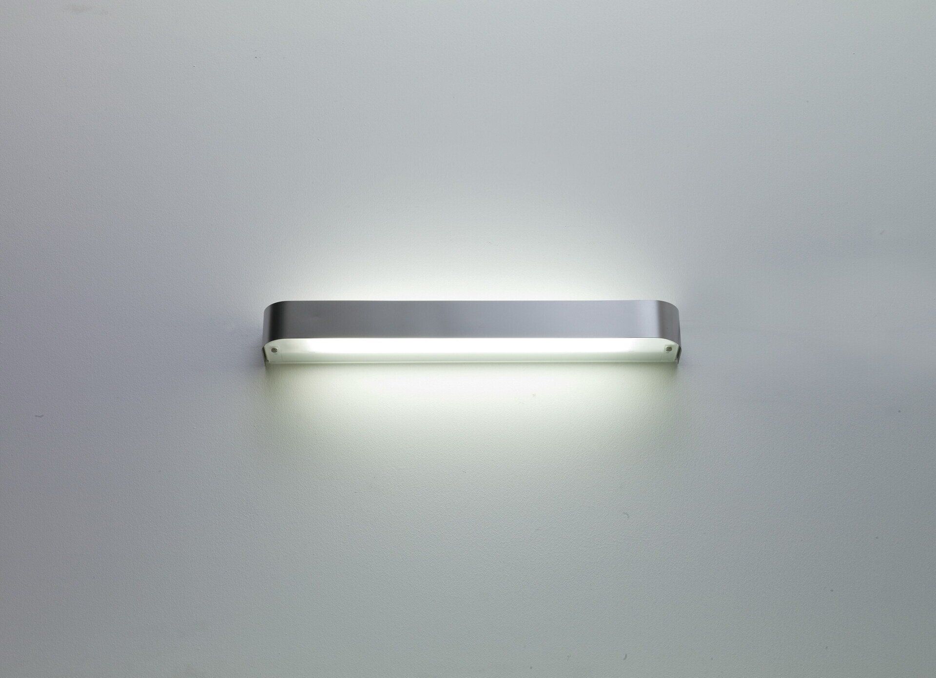
Star
Design by Luigi Trenti, 2009
For Valenti, 2009
Star, included in Valenti's catalog, was a wall and ceiling lamp, characterized by the star design of the convex front and shaped to allow the simultaneous emission of direct and radial light, avoiding to show the light source, a T5 circular fluorescent.
Satin white glass diffuser.
Zodiaco
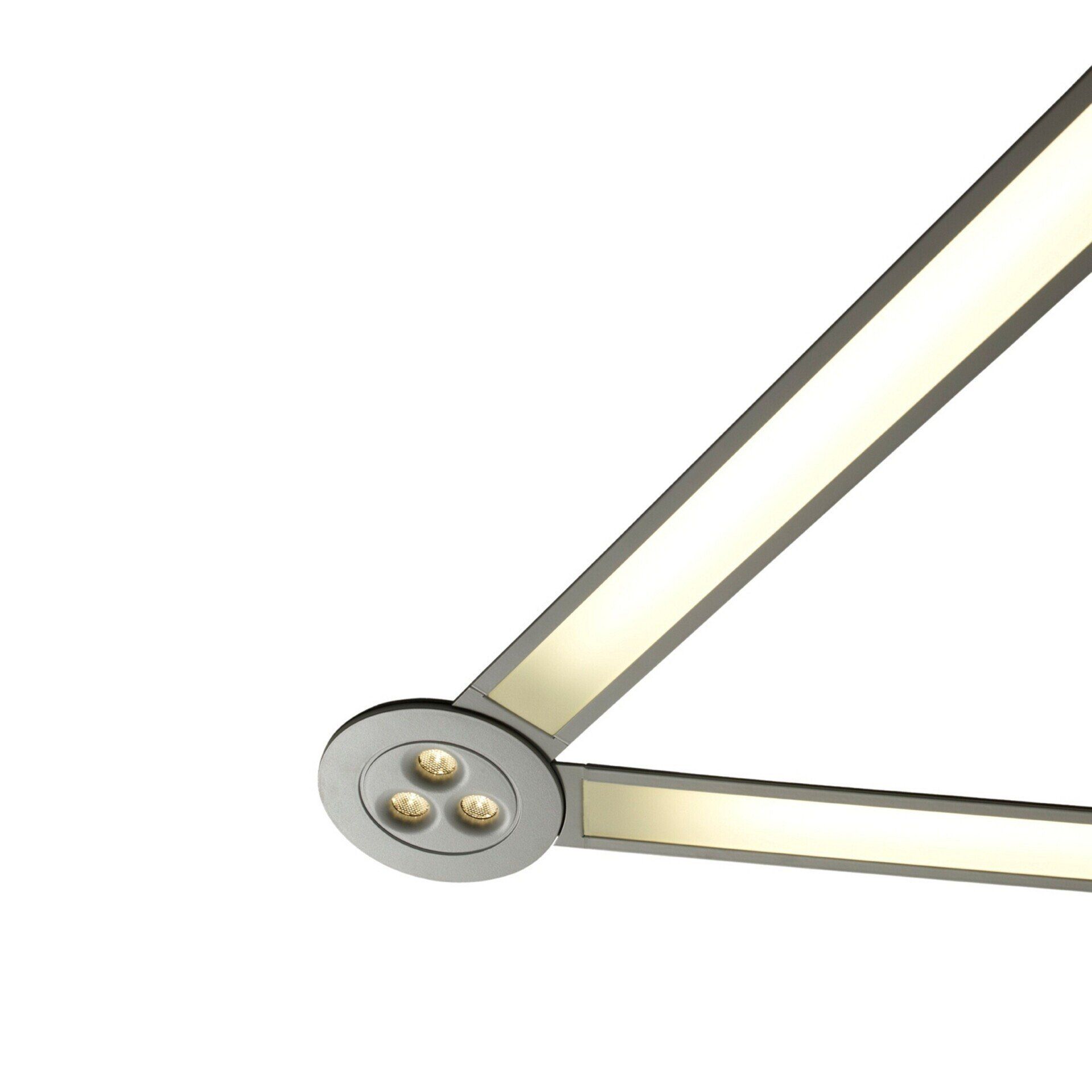
Design by Luigi Trenti, 2009
For Valenti, 2012
Inspired by the method of graphic representation of the constellations, Zodiaco was a system designed to combine linear and recessed fixtures with fixed or adjustable point light sources, but also technical accessories such as cameras, speakers, anemostats.
The lighting system thus extended its role, integrating several elements into the same path to create an ordered constellation of integrated functions.
The possibility of combining the elements in different configurations made it possible to illuminate paths, passages, corridors as well as large spaces.
The joining elements connote the countless possible configurations both aesthetically, creating a movement of light just like in constellations, and in terms of luminous efficacy.
Successfully presented at Euroluce 2012, it unfortunately did not have the commercial diffusion it deserved because the manufacturer went bankrupt shortly after.
This concept was taken up by various other manufacturers and an example can be seen inside the Samsung headquarters in Milan.
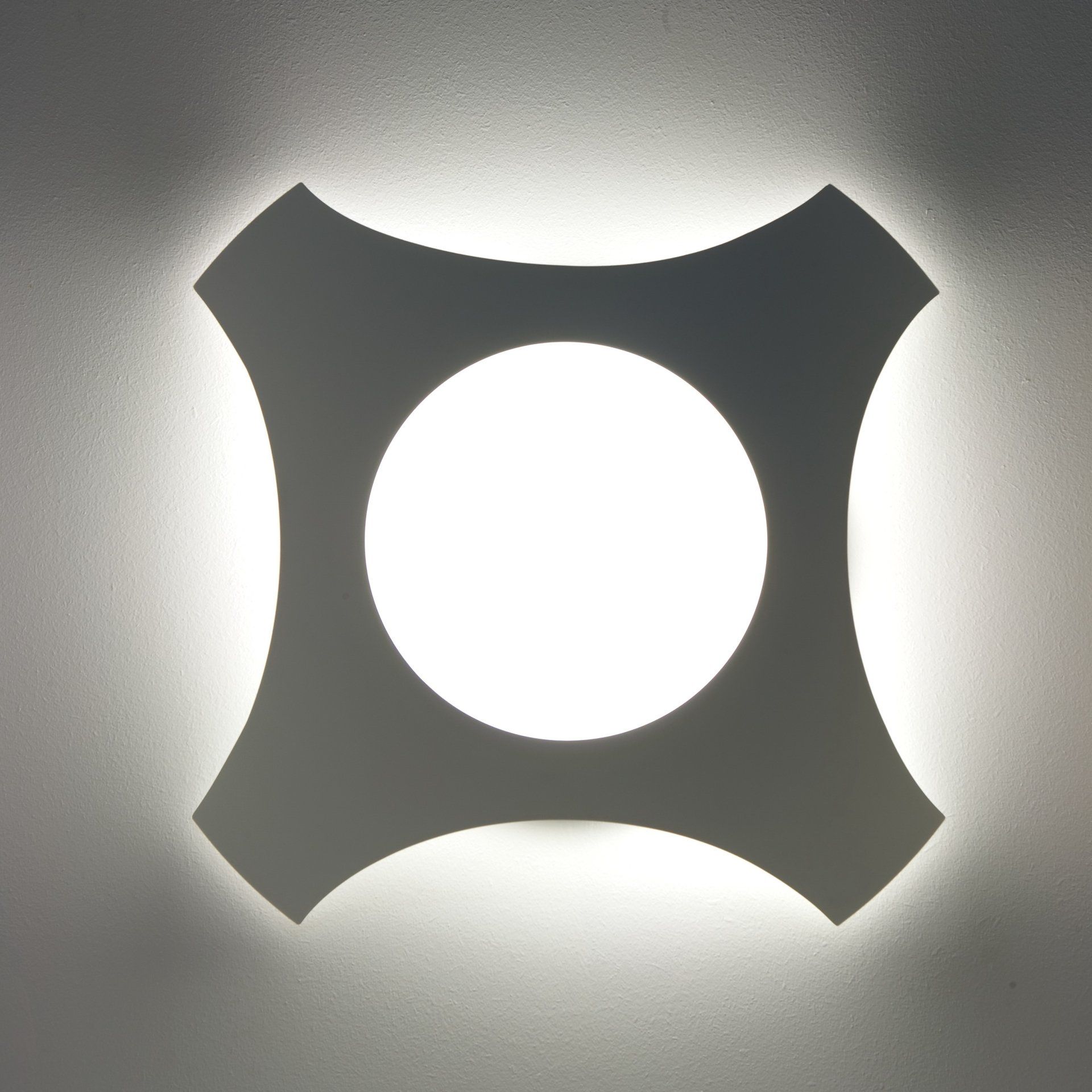
Appeal
Design by Luigi Trenti, 2009
For Valenti, 2009
Initially conceived for iGuzzini and then produced by Valenti for the Prometeo Light catalog, the Appeal collection of lamps is intended to represent the stylization of the classic concept of a wall lamp with a parchment diffuser.
Although it may seem a trivial form now, it was one of the first examples of a wall lamp born with these characteristics.
The front screen should have been covered in reflective fabric, the same used in sports jackets, or in steel mesh, used in the cladding of modern buildings, although it was later made in brushed or polished steel or painted matte white.
The wall support disappears from view, the shape becomes linear, thin and clean, the edges softly rounded, while the incandescent bulbs give way to the most modern light sources.
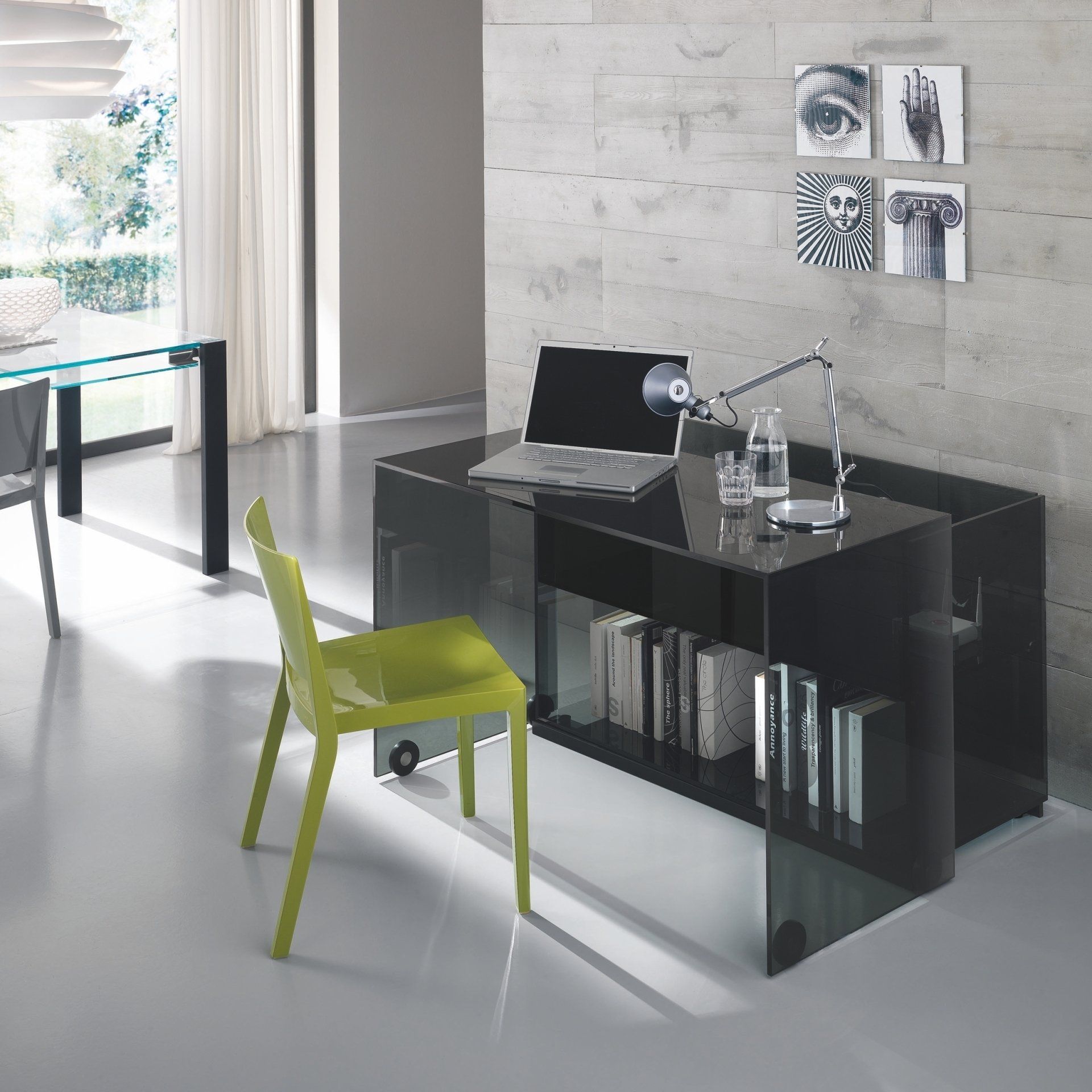
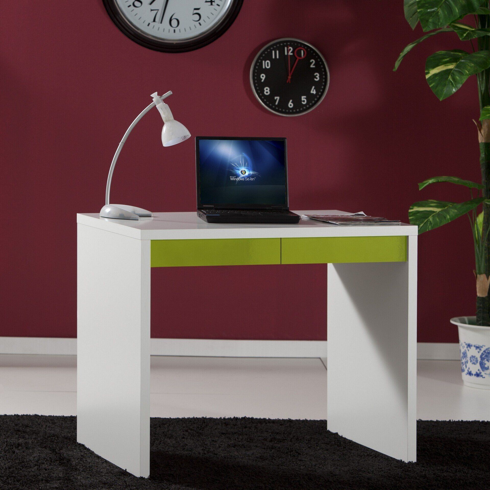
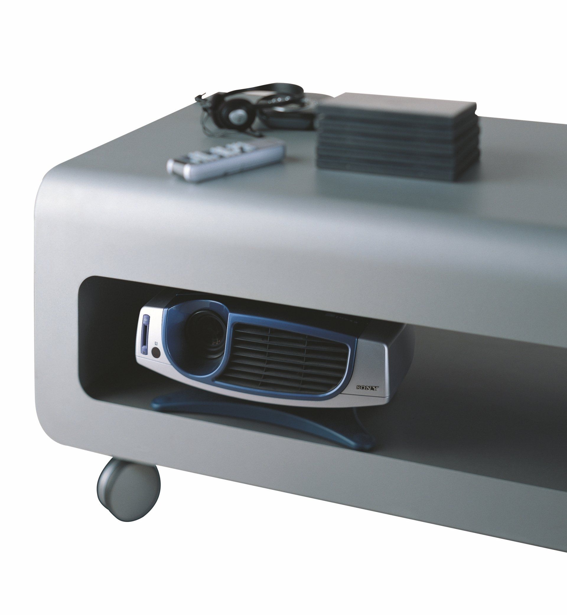
Server
Design by Luigi Trenti, 2002
For Tonelli Design, 2013
It is a desk that houses a large container where you can keep everything you need for your home office.
Its enigmatic yet essential design is an elegant solution for your everyday life with electronic devices.
The idea was to make a home-office desk that didn't look like a classic desk.
I wanted to create an elegant and essential volume, but roomy and comfortable to use.
Between 2002 and 2012 I redesigned several times this concept of “arch-worktop” that slides forward discovering a large container and creating a comfortable desk, imagining it to be made of chipboard panels for large distribution or with a more rounded design, through the use of honeycomb aluminium panels.
The meeting at the Salone del Mobile in Milan with Tonelli Design leads to the definition of its final version completely in elegant smoked glass, in production since 2013.
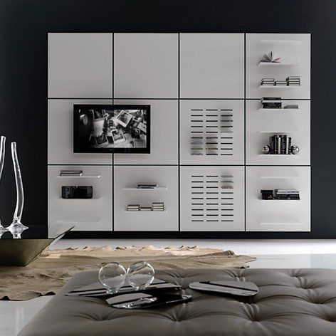
Mosaico
Design by Luigi Trenti, 2010
For Cattelan Italia, 2010
It may seem unbelievable, but no one had ever thought of being able to furnish a wall with square modules, to create combinations at will, applying dedicated modules according to your needs.
Freely modular wall system aggregating square modules with various functions and made of lacquered MDF.
The series is composed of neutral module, modules with shelves, CD holder, mirror and TV holder with VESA bracket.
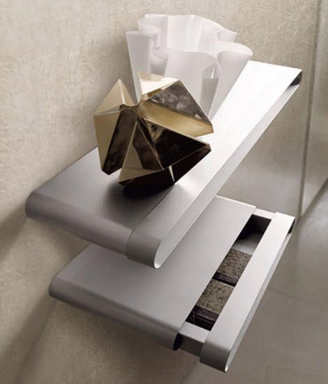
Di Giorno Di Notte
Design by Luigi Trenti, 2004
For Ycami, 2004
Now it may seem normal, but the idea of a shelf that was also a container at the time was completely new.
The use of aluminum then made it possible to realize this concept while maintaining a limited thickness.
Multi-functional wall-mounted drawers / shelf with steel frame for wall mounting, covered in matt anodized aluminum sheet and drawer in sheet and extruded aluminum.
Di Giorno Di Notte it is the innovative element designed to allow, in a single product, the functions of supporting and containing.
"Sui generis" bedside table is able to support objects and at the same time store them inside the drawer made of sheet and extruded aluminum.
Note the masterful execution of the front detail, made with a single drawn, curved twice and closed in the center with a precision of a tenth of a millimeter.
It was presented at the Fashion Show Pavilion where all the best brands of the Salone del Mobile exhibited and selected for the Grandesign Ethical Award.
Dune
Design by Luigi Trenti, 2001
For Artemide, 2001
In 2001, fresh winner of Young & Design with the Lesena lamp, I proposed this concept to the famous producer Artemide.
If Lesena had been inspired by Florentine Renaissance architectures and also by the American deconstructivism of Site, in this case the source of inspiration were clearly the Lucio Fontana's "Cuts".
Art director Huub Ubbens really liked the idea and I produced lacquered MDF maquettes of the two most interesting models.
In my mind there was the idea to develop them with LED sources as in-ground luminaires, but also on the wall as recessed trimless.
After a long wait, in which prototypes were also developed, unfortunately in the end they were not produced.
It was perhaps too early to propose using LED technology, but my intuition turned out to be prophetic.
Later, with an aesthetics close to this concept, many products came out on the market: armchairs, lamps, washbasins, and many were the colleagues who were successful in interpreting this trend.
Arianne
Design by Luigi Trenti, 1992-1994
For Targetti Sankey, 1994
It is one of the three most successful projects of my experience as head of design at Targetti Sankey.
Born as an experimental project and then successfully marketed for over a decade, it was the first technical lighting fixture to be made in Baydur, a technopolymer produced by Bayer, self-extinguishing and non-deformable up to 115 ° C.
The mold equipped with movements has allowed the creation of seven versions of the same body while the facilitated wall fixing system has made it possible to join two bodies to form a single body as an indirect light suspension.
It was designed for T5 compact fluorescent lamps with electronic power supply and was equipped with a dimmer and an emergency module whose battery, with an autonomy of up to three hours, was easily accessible from the outside for replacement.
An innovative double involute reflector made in collaboration with the Goniometric laboratory of the Faculty of Engineering of Florence has been applied to this product.
For all these characteristics it was the best performing product in this typological category and in 1995 it was selected by Jean Nouvel for publication in The International Design Yearbook.
TGE
Design by Luigi Trenti, 1993
For Targetti Sankey, 1993
They were conceived as an evolution of the previous TG recessed luminaires that Targetti produced.
From this project have matured some interesting technical solutions such as:
- the fluorescent recessed that had the elements of electrification co-molded in a single block of silicone rubber, with the volume of the ballast freely positionable depending on the space available in the false ceiling;
- the front ring of polycarbonate screwed bayonet thanks to which it was easy to operate replacements or insert accessories;
- the modelled section of the rings, as if to seek an ideal connection with the entire surface of the ceiling;
- the Multicolor system, i.e. rings in transparent colored polycarbonate inserted inside the front ring that, thanks to the terminal profile of the cylinder, are invested by the light of the source to emit a delicate luminous decoration on the front.
Presented at the Euroluce fair, this series of spotlights, which remained in the catalog for decades, was selected for the Young & Design Award.
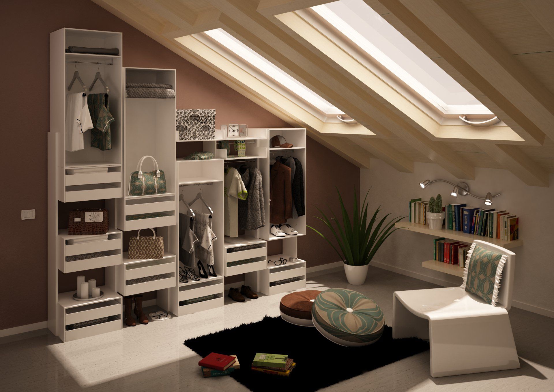
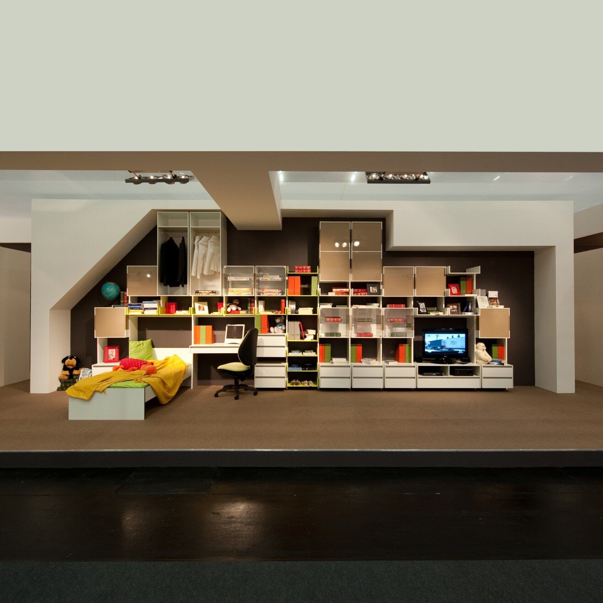
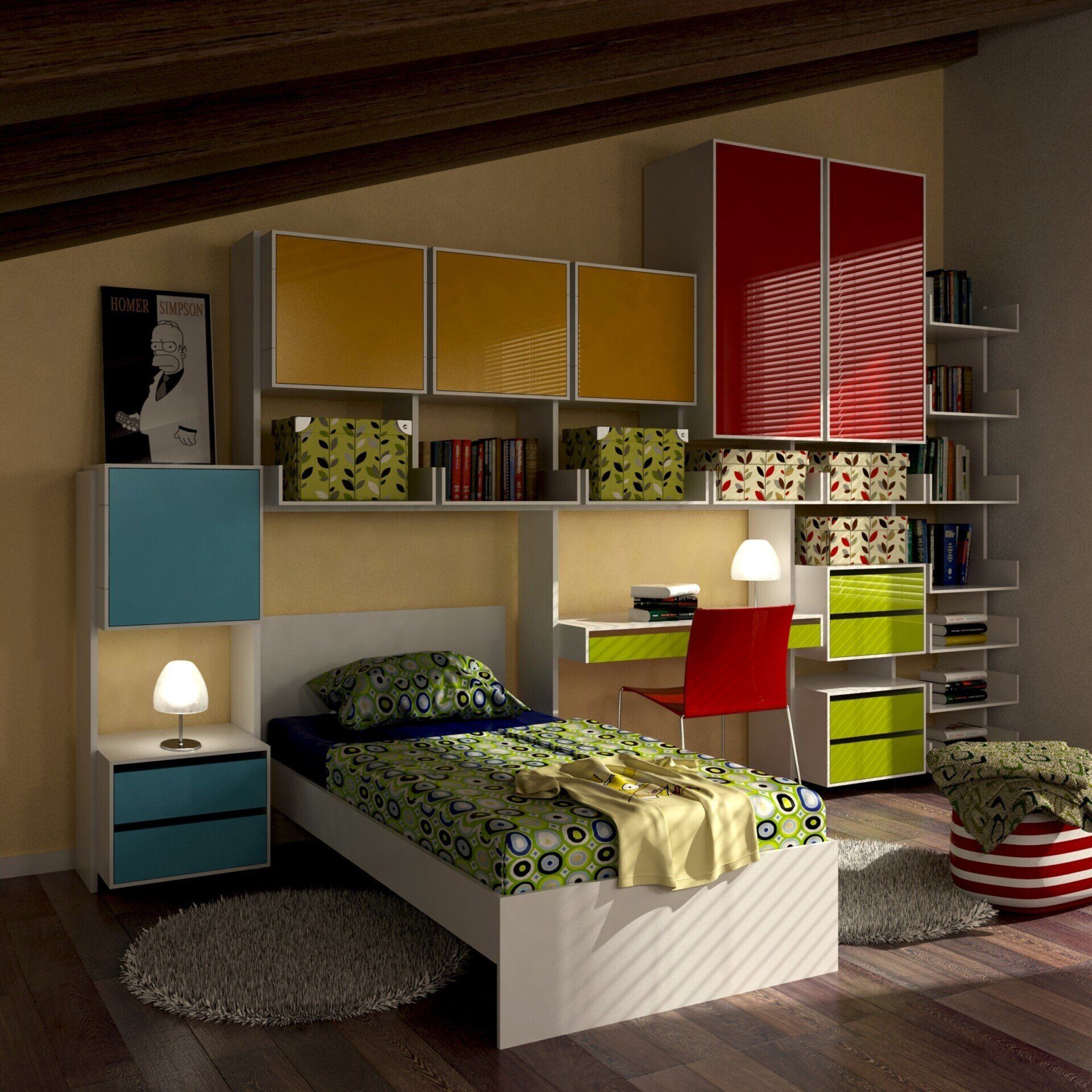
Lift
Design by Luigi Trenti, 2010
For Composad, 2010
The long collaboration with Composad, a company that is part of the Mauro Saviola Group, one of the most important producers of ecological panels for furniture, has allowed me to experiment and propose numerous economic furniture solutions for large retailers.
Lift is a patented concept of height-adjustable furniture, initially conceived as a walk-in closet and then applied also to bookcases and living room walls.
The Lift system, using only 4 elements, is able to adapt to the available space between floor and ceiling, no matter how irregular they are.
Although today you can find many types of walk-in closets, Lift was a real original innovation, which can be safely called "revolutionary" because it really allows you to adapt the furniture to any type of space and environment, covering all possibilities.
Functional and economical Lift is characterized by an elementary construction plan based on solid vertical bearing elements that can be multiplied infinitely.
In addition, three further components can be added at the desired heights: containers for clothes, drawers and shelves.
Lift was manufactured with LEB eco-friendly panels and marketed ready to assemble, using recycled cardboard for packaging.
It was selected for the Grand Design Ethical Award and the Green Dot Award in Los Angeles.
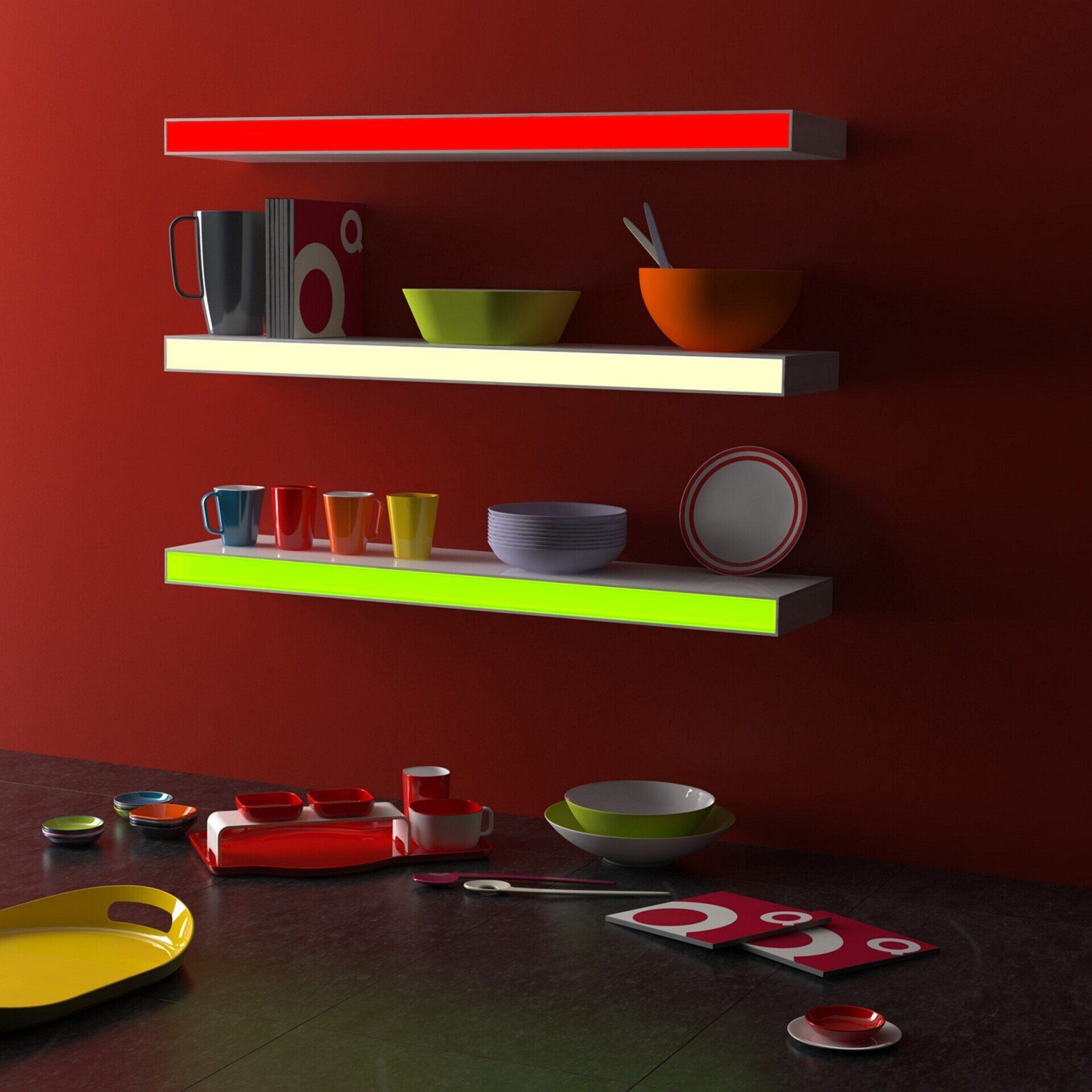
Light Shelf
Design by Luigi Trenti, 2011
For Qsquared LLC, 2011
Ambiente 2011: Qsquared debuts in the world of furniture with a luminous RGB LED shelf.
My experience in the world of furniture and lighting allowed Qsquared to make this product with a very clean execution.
I applied an easy solution for wall mounting and the luminous front panel with push-pull mechanism fixing.
A decorative piece of furniture that works as a shelf for books and objects, but also as a lamp suitable for private and public spaces.
Main features are dimmable RGB light, glossy lacquer finish, high lift, low power consumption, no visible fixing, programmable remote control.
Magia
Design by Luigi Trenti, 1998
For Lipparini, 1998
Lipparini has been a very successful manufacturer of brass beds for many years. When they decided to expand the product range to include lamps, I was contacted because I was the only young designer selected for the Young & Design award with a lighting product.
Thus was born Magia, a collection of lamps based on a concept of variable diffuser inspired by the floral world.
Thanks to a joint of my own design, the "scavo" glass diffusers of Magia lamps could move independently of each other with a 360° planar rotation that allowed for ever-changing light and shapes.
The diffusers were made by cutting simple blown glass spheres of current production.
From every sphere complete diffusers for three lamps are obtained, obtaining a curious and refined product but containing however the productive cost.
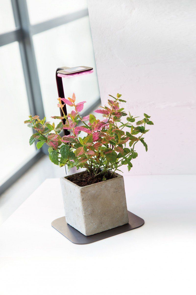
Stick Grow
Design by Luigi Trenti + R&D Wiva Group, 2017
For Wiva Group, 2017
Stick Grow, a research project of Wiva Group, is an effective alternative to sunlight for the growth and maintenance of plants in indoor environments.
The LED light emitted by the device activates the process of photosynthesis and stimulates plant growth.
There were many examples on the market that were more reminiscent of laboratory objects, bulky and ungainly in shape, where the plants are suffocated inside.
Instead, I wanted the plant to be the protagonist, making the lamp disappear as much as possible.
Stick Grow is therefore made up of two light elements in shaped and curved sheet metal, connected to each other, with the upper part that allows an upward extension to accommodate the growth of the plant.
The plant rests on the metal or on an accessory wooden platform. It has been designed in single, double and triple versions.
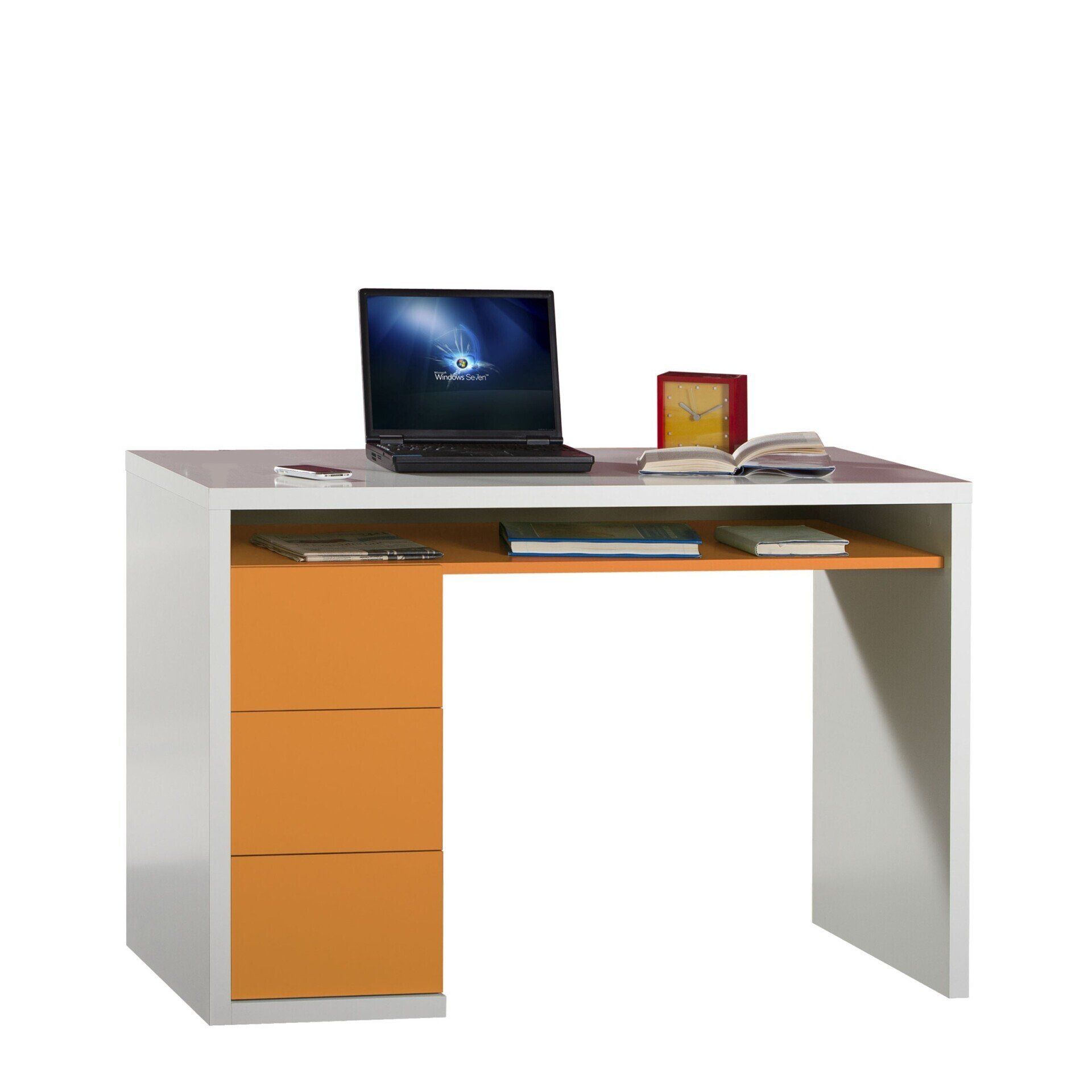
Moneta
Design by Luigi Trenti, 2011
For Composad, 2011
This series of desks declined in three versions, characterized by a clean and contemporary line, made of strong thicknesses and handleless lacquered containers, ten years after its introduction on the market has become the best seller of Composad, appreciated and distributed in many markets internationally.
A great satisfaction with a timeless, pleasant, economic, ecological and global product.
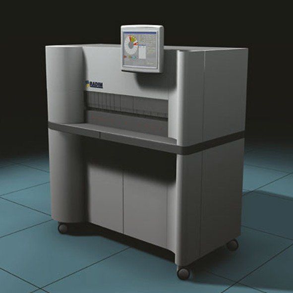
Rad 120
Design by Luigi Trenti, 2005
For Seac Radim Group, 2005
RAD 120 was an analyzer for fully automated execution of immunological assays on serum, plasma and biological fluids.
The system, equipped with real random access with continuous loading, had a wide panel of analytes for the execution of tests in all the main areas of in vitro diagnostics.
The particular working philosophy Intermediate Operational Area allowed to access all the resources of the system including reagents at any time, and to introduce them into the operational flow without slowing down the work routine.
This innovative system allowed the optimization of seat times and made the RAD120 an instrument adaptable to any laboratory need.
In this project I applied elements in lacquered polyurethane and satin stainless steel typical of the kitchen furniture sector
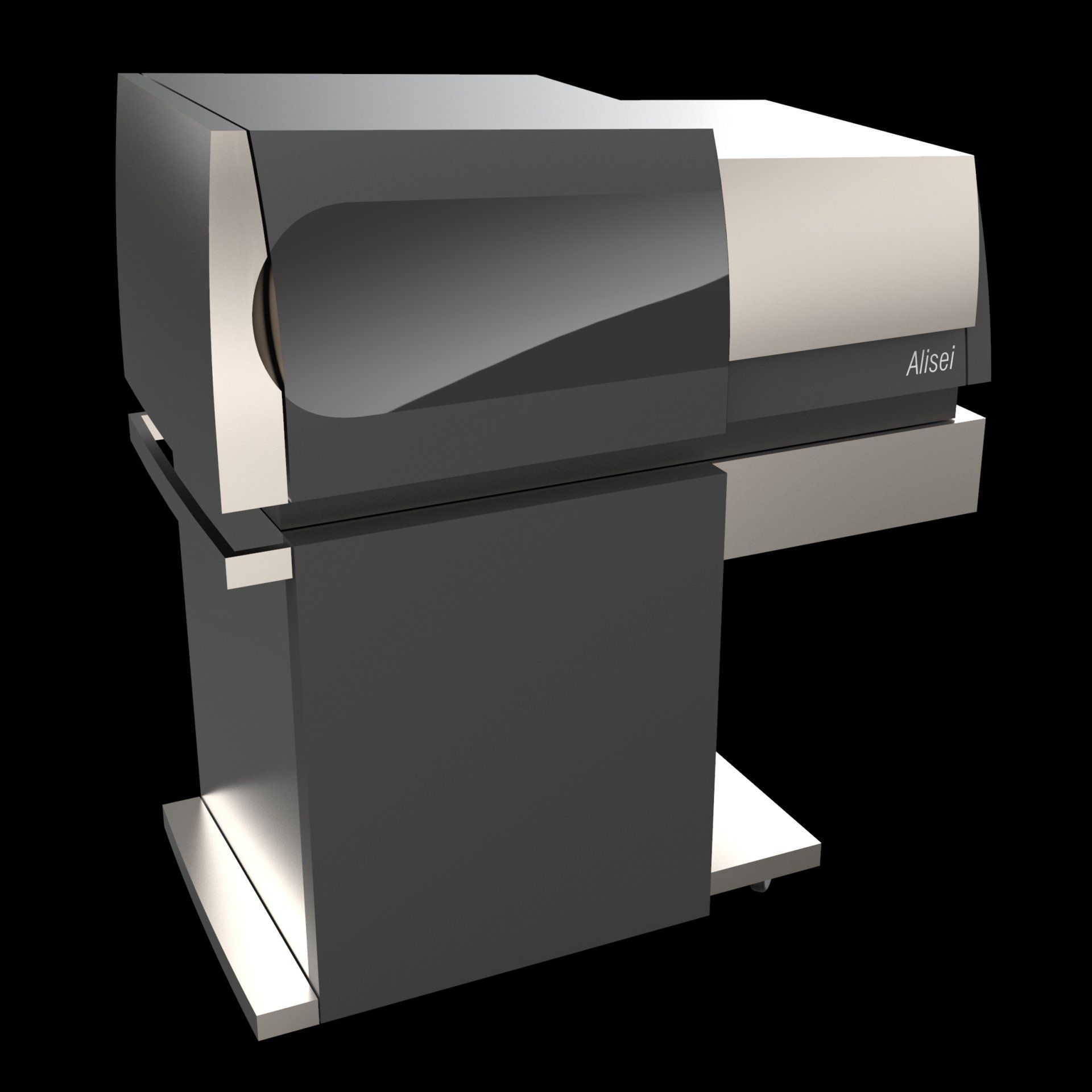
Alisei
Design by Luigi Trenti, 1997
For Seac Radim Group, 1998
It is a fully automatic microplate based enzyme immunity analyzer, able to perform analysis with 6 microplates for 12 different analytes at the same time, all managed by computer, with refrigerated reagents and barcode reading of samples/reagents.
This was a particularly competitive use configuration at that time.
Alisei, which was previewed at the Medica in Dusseldorf in 1998, had an innovative design like the technique that housed inside it: in a world of quite homologated instrumentation design, a dynamic wedge-shaped line was proposed, characterized by almost sharp edges and surfaces moderately curved to dress without wasting space, only the necessary volumes.
Alisei was selected for the BIO in Ljubljana and published on the ADI Design Index, preselection for the Compasso d'Oro.
Although the company closed years ago and the know-how passed to Next Level, after more than 20 years, ALISEI is still in production and about 7 of them are produced every month!
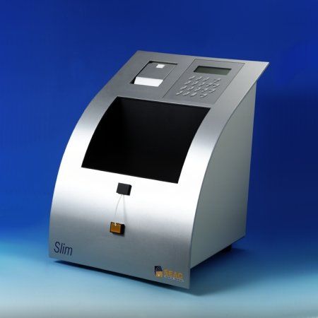
Slim
Design by Luigi Trenti, 1999
For Seac Radim Group, 1999
The photometer for Clinical Chemistry Slim was the basic instrument for any type of laboratory, clinic or hospital department: it performed readings of reactions end point, kinetic, fixed time, multistandard and differential, in absorbance and in concentration, with standard or with K factor. 199 methods in memory with possibility to program for each method the type of reaction, the wavelength, the temperature, the unit of measurement, the normality values, the volume of the aspirated liquid, the incubation times and the measurement intervals. Reading with flow cuvette or with single cuvette in mono and bichromatism. The instrument was equipped with a liquid crystal display for programming operations, a cuvette compartment for thermostatting samples, an alphanumeric membrane keyboard, a reading compartment for measuring samples, and a graphic printer for printing data, calibration and kinetic curves. System open to all clinical chemistry tests on serum, plasma and whole blood. The photometer for all needs, from routine to emergency, for small and large laboratories.
These are the technical specifications of the photometer that I designed, completely overturning the typical layout of benchtop instruments of this kind.
No more low and rounded beige shapes, but a slender upward object, with a decisive and simple shape, defined by only two pieces made of curved sheet metal.
Exhibited at BIO in Ljubljana, it remained on the market for almost twenty years.
Asia
Design by Luigi Trenti, 2019
For Visconti, 2019
Celluloid is a material invented in 1863 by John Wesley Hyatt, which has been widely used in the past for the production of pens.
Because it was highly flammable and complex to produce and handle, it is no longer produced.
This fact made celluloid pens particularly attractive to collectors.
Visconti's last stock of celluloid was used for the Asia pens, and since there were only small pieces, this design featuring short segments of ringed and black celluloid was born.
Although it was very similar to the coral snake, in the end we opted to call it Asia, as it could also recall the design of the bamboo plant.
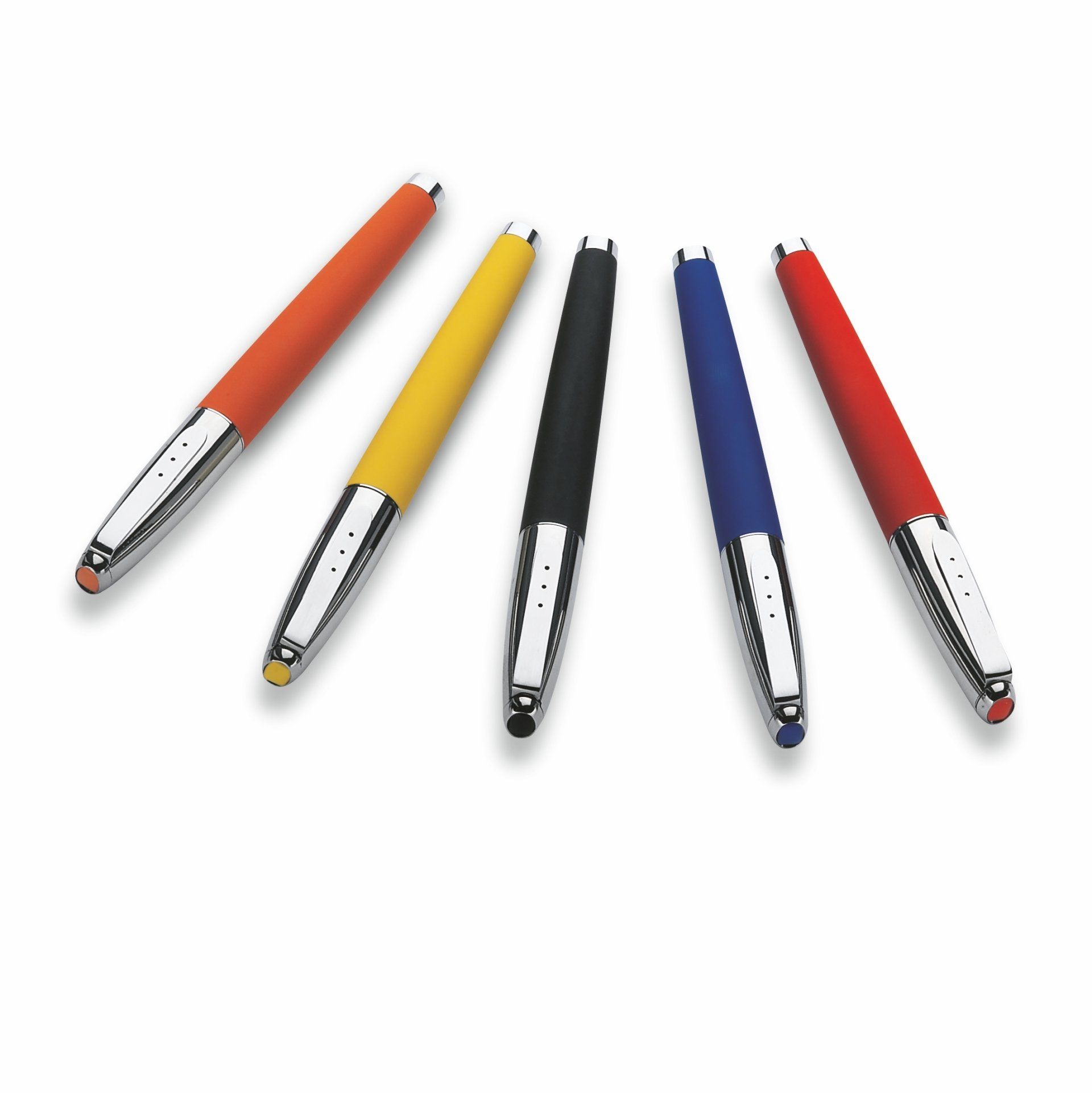
Sport Pen
Design by Luigi Trenti, 2003
For Locman, 2003
The Locman writing instruments were born to be part of the well-known collection
of watches made by the Tuscan firm, which is located in the Elba Isle.
The purpose was that of proposing some objects which were pleasantly tuned with
the simple and fresh expressive philosophy of the pre-existent Locman products.
Here is, therefore, a use of light bodies made of anodised aluminium for the Sport
version or lucid aluminium for the Nuovo version, with gummed shanks in the range
of colours present in the catalogue (orange, red, yellow, blue, black).
On the cap, the clip and the shank are the stylised but recognisable representation
of the strap and the case of the watches branded Sport or Nuovo, with the coloured
clock-face made by using soft resined gems, which represent a very current
technical solution, for the application of logos and brands on manufactured
objects, but fresh in the sector of writing instruments.
Nuovo Pen
Design by Luigi Trenti, 2003
For Locman, 2003
The Locman writing instruments were born to be part of the well-known collection
of watches made by the Tuscan firm, which is located in the Elba Isle.
The purpose was that of proposing some objects which were pleasantly tuned with
the simple and fresh expressive philosophy of the pre-existent Locman products.
Here is, therefore, a use of light bodies made of anodised aluminium for the Sport
version or lucid aluminium for the Nuovo version, with gummed shanks in the range
of colours present in the catalogue (orange, red, yellow, blue, black).
On the cap, the clip and the shank are the stylised but recognisable representation
of the strap and the case of the watches branded Sport or Nuovo, with the coloured
clock-face made by using soft resined gems, which represent a very current
technical solution, for the application of logos and brands on manufactured
objects, but fresh in the sector of writing instruments.
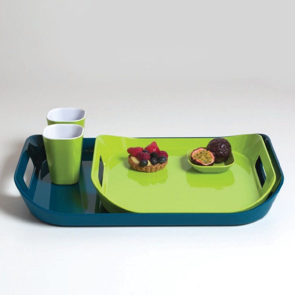
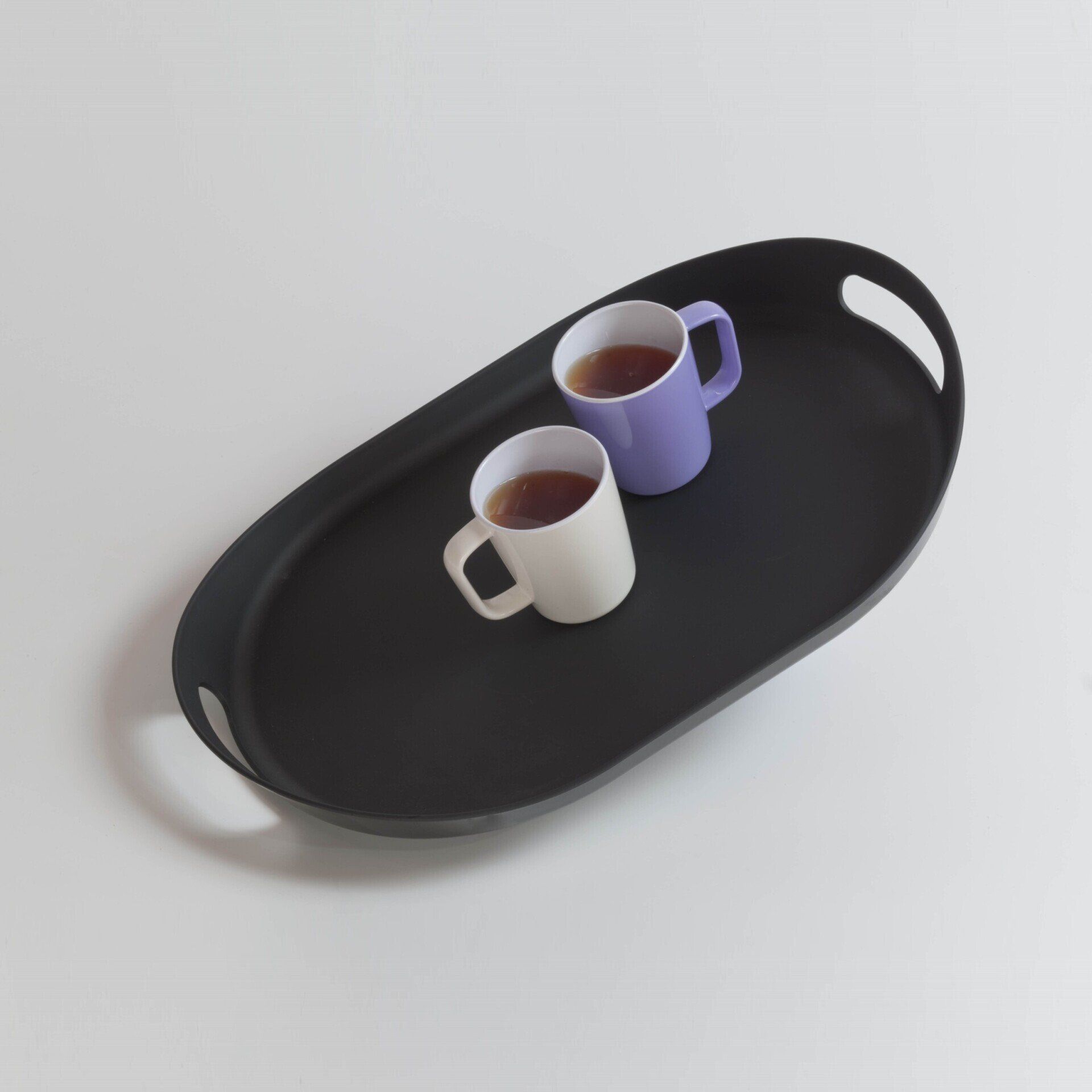
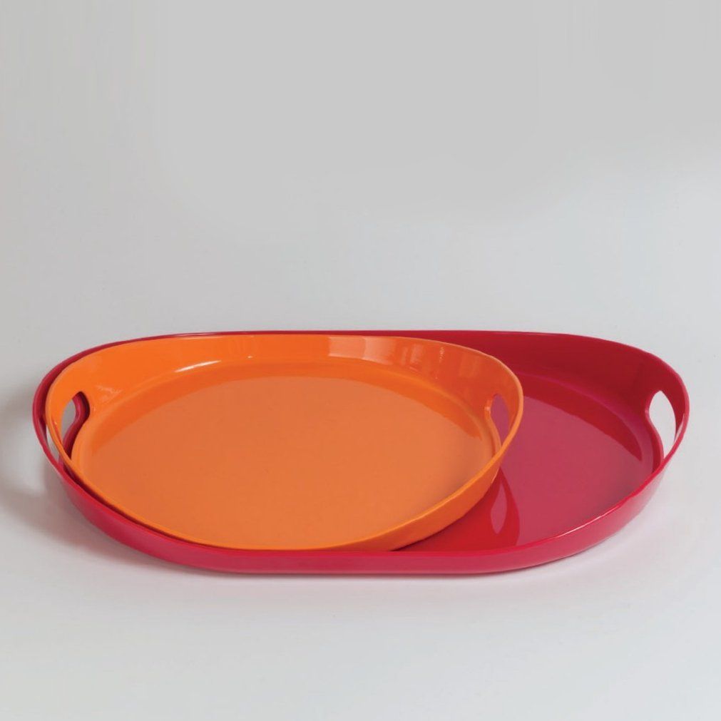
Trays
Design by Luigi Trenti, 2010-2011
For QSquared LLC, 2011
QSquared was a New York-based manufacturer specializing in melamine tableware, for whom I did design and art direction.
The catalog needed a few key products of certain commercial success.
Trays with handles for example, in at least two stackable sizes to be sold in twin sets and two shape variants, curved and squared.
These products have been marketed in numerous color variants and also in the "anti-slip" version which, thanks to a special treatment of the support surface, considerably improves the adherence of objects to the surface.
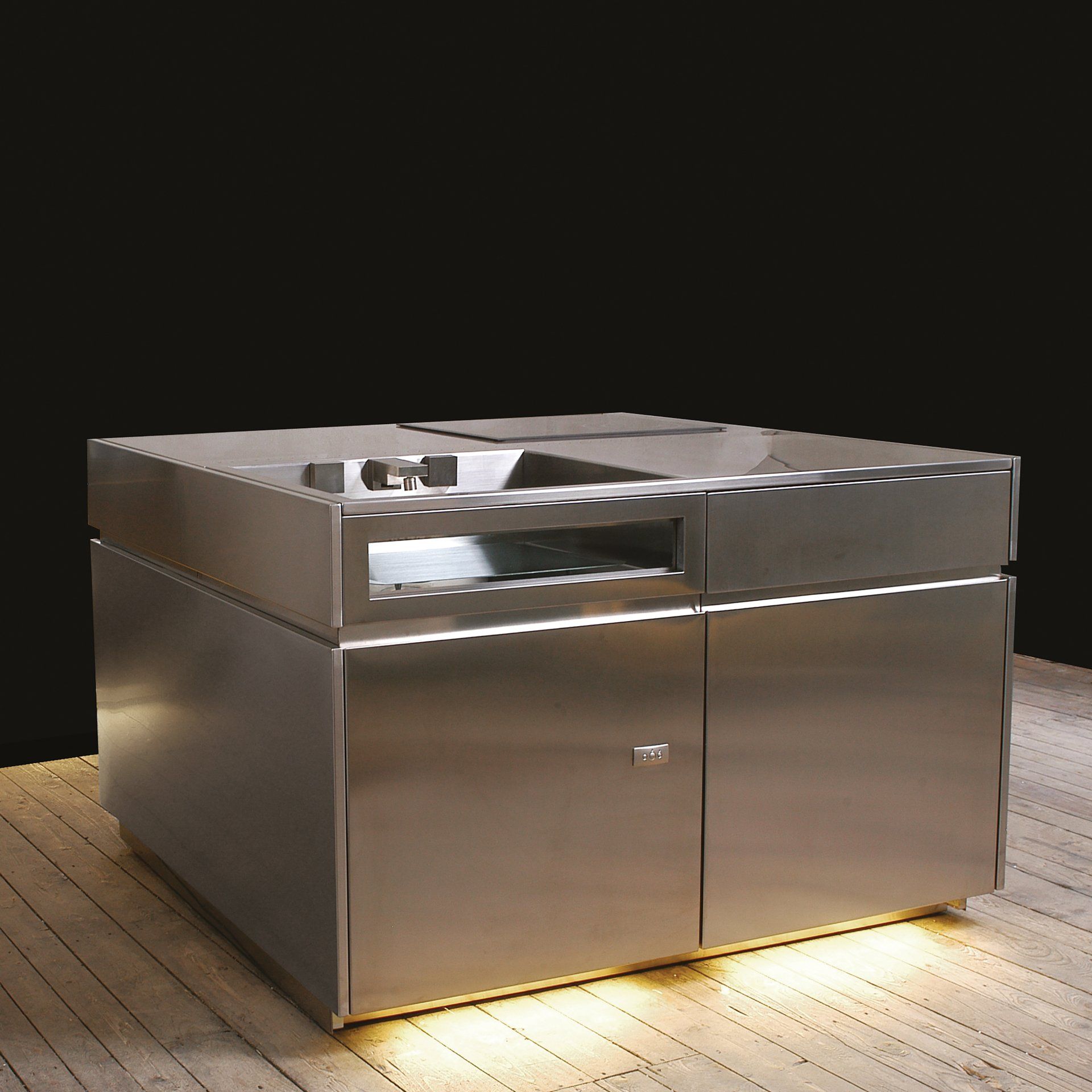
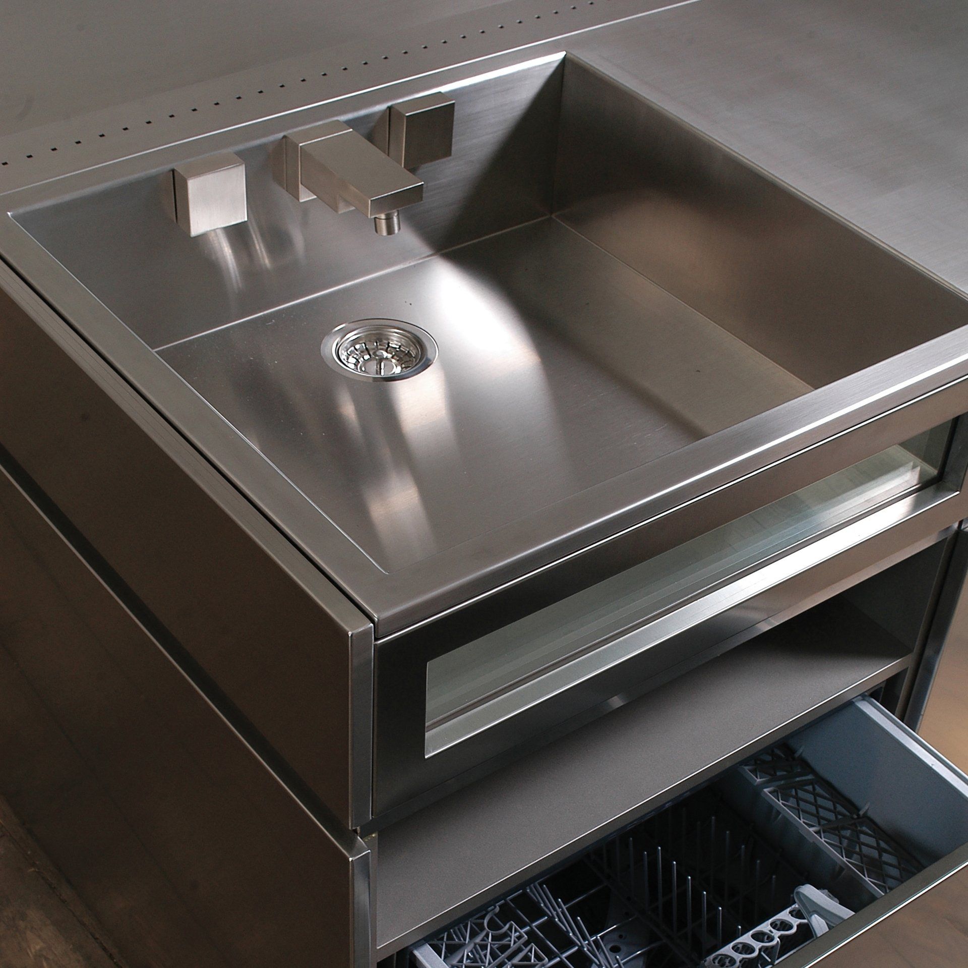
Metrocubo
Design by Luigi Trenti, 2004
For Ciatti a Tavola (Opinion Ciatti), 2004
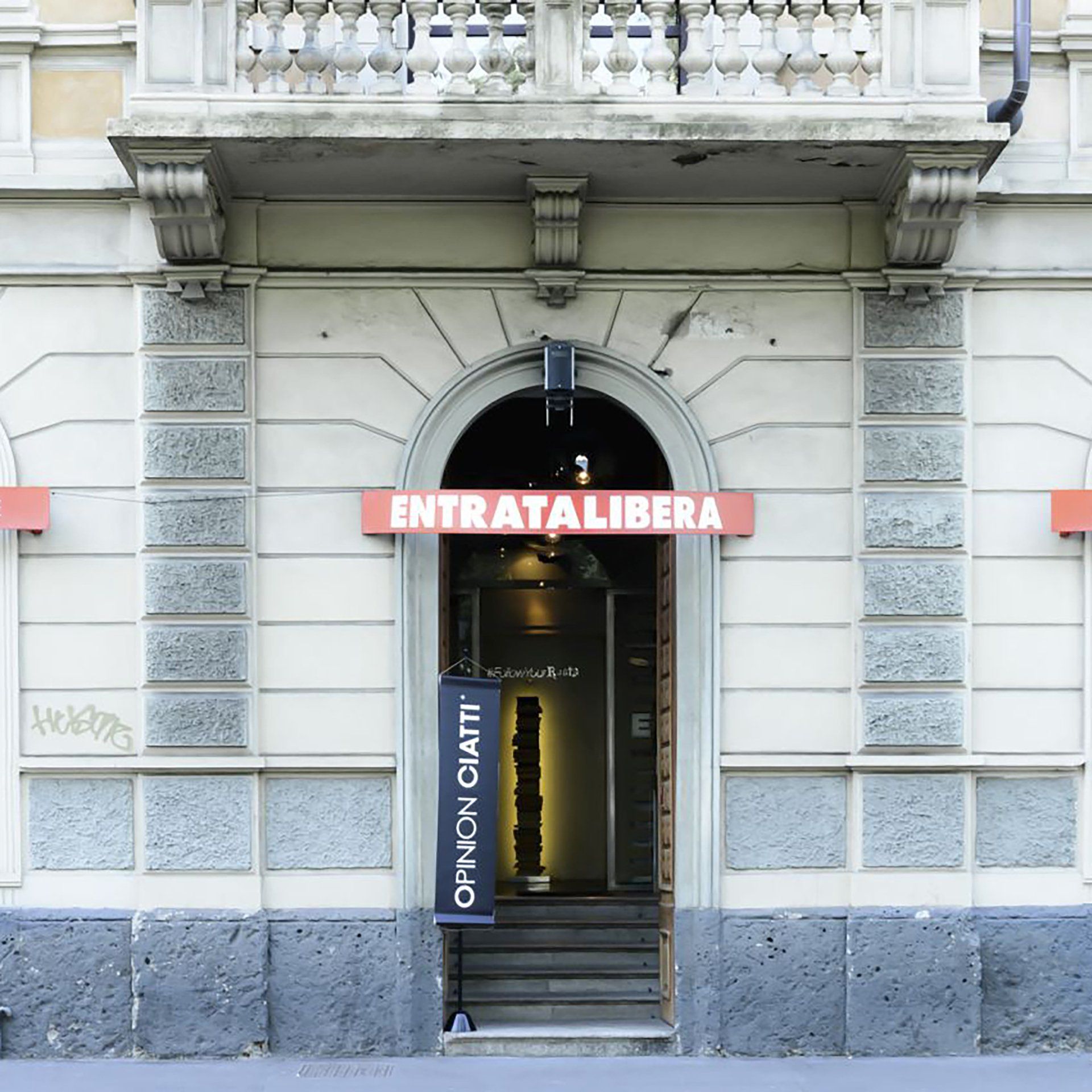
This was an innovative and compact “all in one” kitchen unit designed for Ciatti a Tavola (now Opinion Ciatti), with the collaboration of Whirlpool and Gessi and showed at the famous Fuorisalone showroom Entrata Libera by Bruno Rainaldi during the Salone del Mobile in 2004.
A simple squared geometry is taken to the highest possible levels of expression of a clean design without sacrificing the vital functional requirements.
None of the surface areas, including the horizontal surface, have protrusions but 135x135x90 cm of stainless steel contain a large sink with a suggestive transparent front wall, a dish washer for 6, a 130 litre under unit fridge, a cooking unit made by ceramic glass, a multipurpose oven, two large drawers and a pantry unit.
This modular kitchen concept included the option of creating an island, or lining up the two wall modules.
Note the liftable faucet aligned with the top, a true innovation of the project, which at that time did not exist on the market and was later developed by various manufacturers. Luigi Trenti designed some versions, one of which was developed by Gessi for this project.
Metrocubo
Design by Luigi Trenti, 2004
For Ciatti a Tavola (Opinion Ciatti), 2004
This was an innovative and compact “all in one” kitchen unit designed for Ciatti a Tavola (now Opinion Ciatti), with the collaboration of Whirlpool and Gessi and showed at the famous Fuorisalone showroom Entrata Libera by Bruno Rainaldi during the Salone del Mobile in 2004.
A simple squared geometry is taken to the highest possible levels of expression of a clean design without sacrificing the vital functional requirements.
None of the surface areas, including the horizontal surface, have protrusions but 135x135x90 cm of stainless steel contain a large sink with a suggestive transparent front wall, a dish washer for 6, a 130 litre under unit fridge, a cooking unit made by ceramic glass, a multipurpose oven, two large drawers and a pantry unit.
This modular kitchen concept included the option of creating an island, or lining up the two wall modules.
Note the liftable faucet aligned with the top, a true innovation of the project, which at that time did not exist on the market and was later developed by various manufacturers. Luigi Trenti designed some versions, one of which was developed by Gessi for this project.
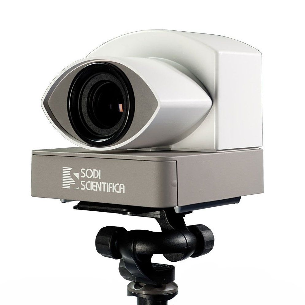
Autovelox®106
Design by Luigi Trenti, 2013
For Sodi Scientifica, 2013
Sodi Scientifica is the Florentine inventor of the Autovelox®, a term now universally recognized by the Accademia della Crusca, to identify speedometers and now present in all Italian dictionaries.
The speedometers for vehicular traffic designed and marketed by Sodi have always been the leading products in Italy in their category.
In addition to the most famous product, the Autovelox®, which has now reached the Autovelox® 106 model, Sodi's offer also includes complementary products such as software for the reading of license plates, detectors of traffic violations and equipment to allow the use of the equipment at night.
For Sodi Scientifica I designed this cover for the digital camera and CPU, drawing inspiration from the historical iconography where generally this shape has been interpreted as the eye of God protector of humanity.
In the modern era, the most notable use of the eye of providence is in the reverse of the Coat of Arms of the United States of America, which also appears on US dollar bills, while the Eye of Horus is in the Egyptian religion the symbol of protection and prosperity, of royal power and good health and we find it reproduced also on the cover of the famous album Eye in the sky by the Alan Parson Project.
Although the Autovelox® is very hated for the fines, the number of accidents and victims where they have been installed has been very reduced and I'm happy to have collaborated to the cause.
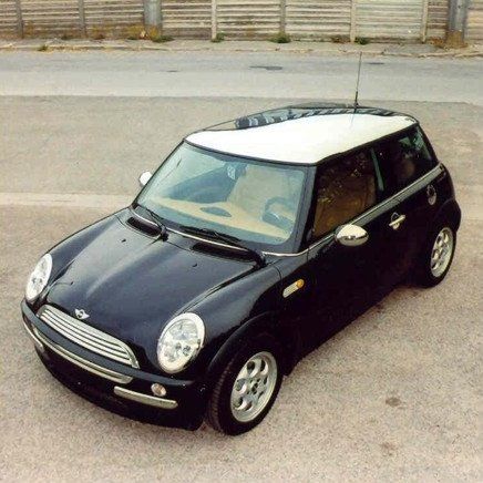
Mini Mirror
Tuning by Luigi Trenti, 2001
For MINI BMW, 2001
The assignment came from a major local dealership that wanted to propose an original tuning to BMW that could become an official list version.
I proposed some solutions among which the application of matte paint that no one had ever thought of (the only vehicles on the road with matte paint were military vehicles), many years before the advent of the wrapping fashion!
Throughout its history, the exterior look of the MINI has been strongly characterized by a few common elements; in particular, two body colors and a large amount of chrome elements have often been used.
Consistent with what has been documented in the history of MINI, the idea of this special tuning was based on the application of many elements with mirror finish combined with the factory colors for the body. From this concept came the name Mini Mirror, which recalled and rhymed with Mini Minor. The highlight of this tuning was the mirrored roof that had never before been offered on a production car.
To achieve this result it was necessary to make a thermoforming mold of the roof to make ABS components to be chromed and then applied to the body.
This was not an easy task, both because of the large size of the piece to be chromed and because of the difficulty in obtaining defect-free chromed pieces.
It was exhibited in dealerships and were sold a few dozen copies, then BMW did not decide to sell it officially.
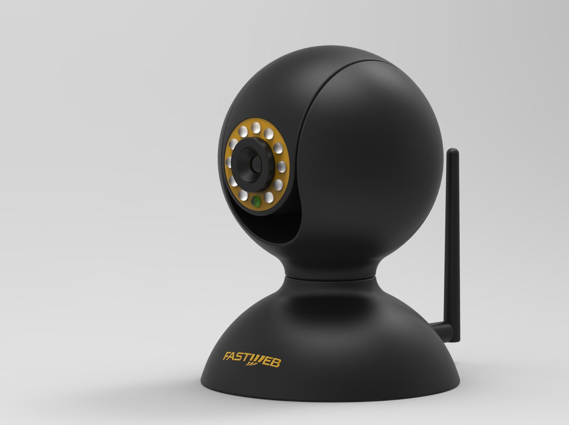
Sentinel
Design by Luigi Trenti, 2014
For Gruppo DMW Ltd, 2014
On the market there are many camera solutions for video surveillance, commonly grouped into two different types, Bullet and Dome.
Aesthetically speaking, there is a widespread and homologated "technical" image of these objects, although in some cases they have well-designed solutions and finishes.
In order to effectively differentiate the Sentinel product, it was necessary to radically rethink the external aspect in order to obtain an image of a design object, of a furnishing component, inspired, for example, by the world of lighting.
The result is a clean shape, consisting of a sphere superimposed on a hemisphere, connected to each other. The geometry is a bit anthropomorphic as it recalls the head of a man on the shoulders.
Bend
Design by Luigi Trenti, 2003
For Ciatti Segnali di Casa, 2003
It was a TV cabinet conceived as a closed volume defined by only two curved aluminium sheets assembled through internally hidden joints.
The frontal opening allowed the insertion of two peripheral devices; the back opening allows the discreet exit of the relative connection cables.
The economic and minimal construction concept generated a product with a modern image and gave Bend the right drive and expressiveness to compete with products placed on much higher price ranges.
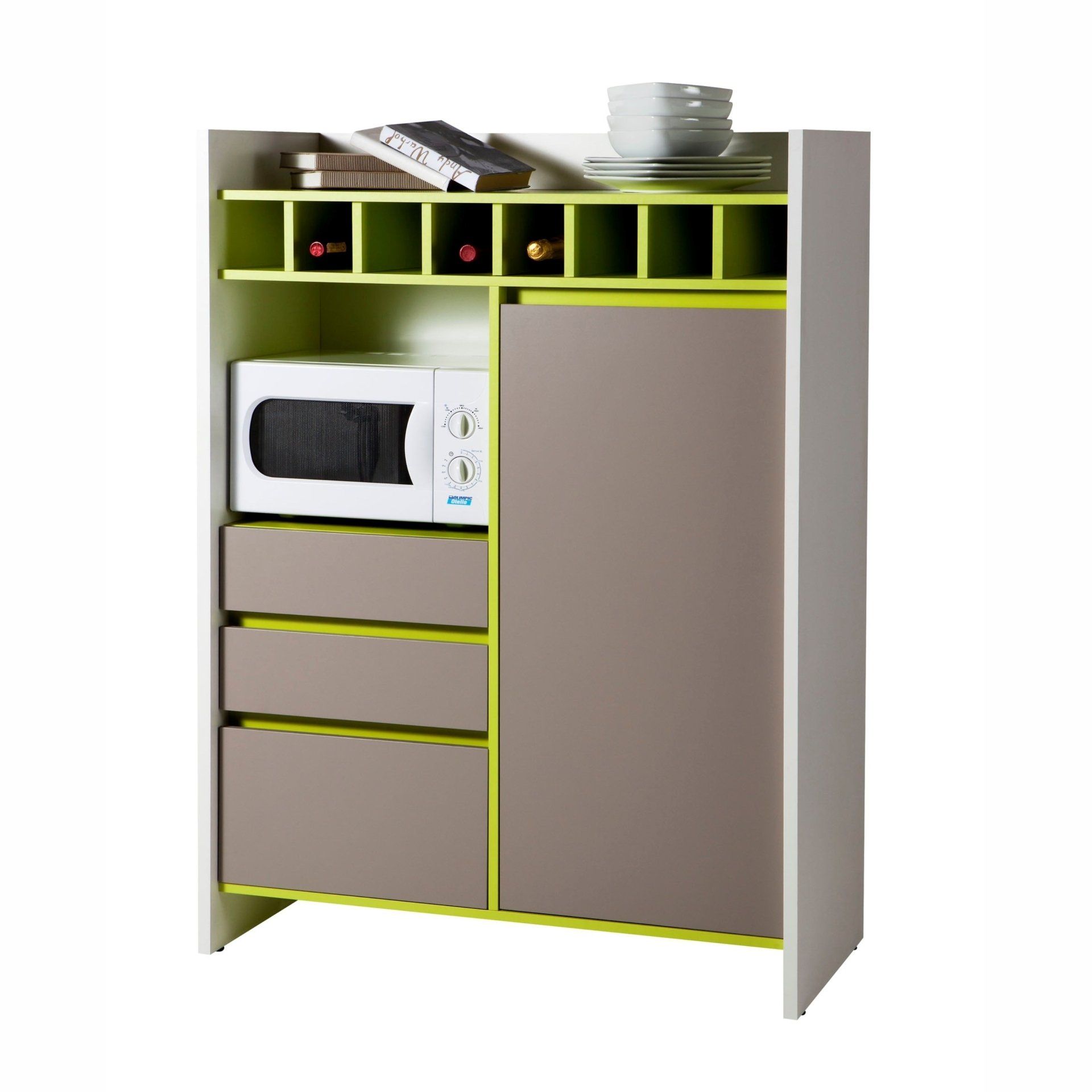
Pic & Nic
Design by Luigi Trenti, 2011
For Composad, 2011
Composad, a leading company in the field of furniture in kit has produced furniture for many customers of the large international distribution.
The typology of the buffet furniture, is very important for the French market, and has been addressed on numerous occasions, for the catalog of various customers.
Pic & Nic are two examples with a very strong design, characterized by bright colors and unusual solutions such as the bottle holders and the design of the external panels.
Hexagon
Design by Luigi Trenti, 2003
For Ciatti Segnali di Casa, 2003
The desire to create a TV stand unit that could also be used as an aggregate module for trade fairs and sales outlets took concrete form in Hexagon, whose geometry in plan traced the outline of kinescope televisions and allowed the composition of free display geometries.
Despite some industrial licenses that I do not share, the final product reflected quite faithfully the initial design.
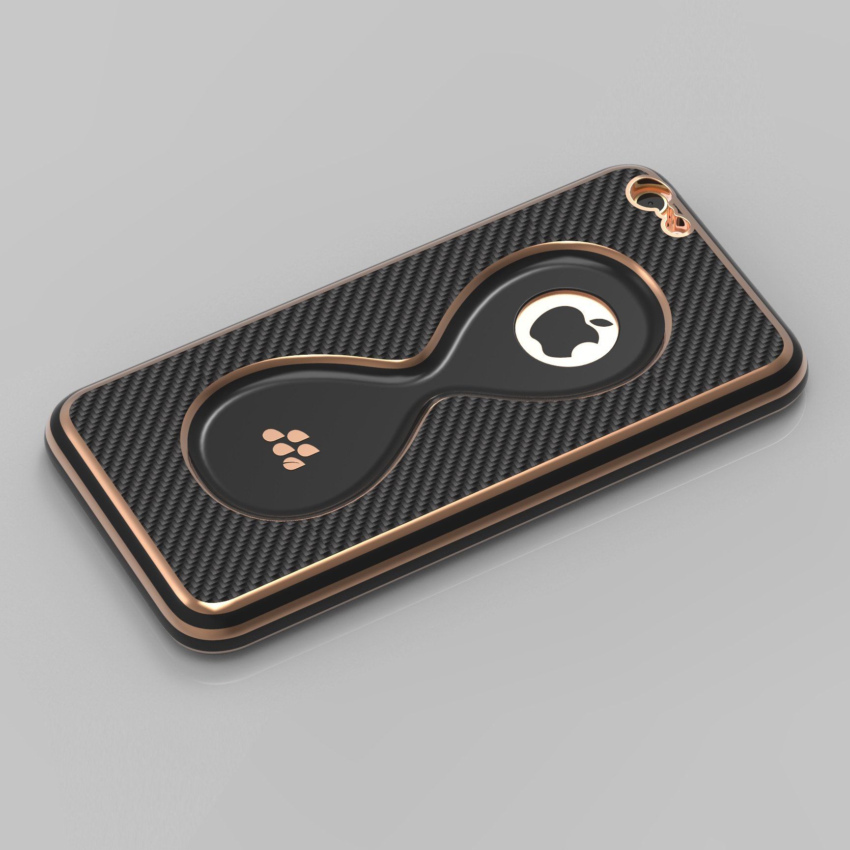
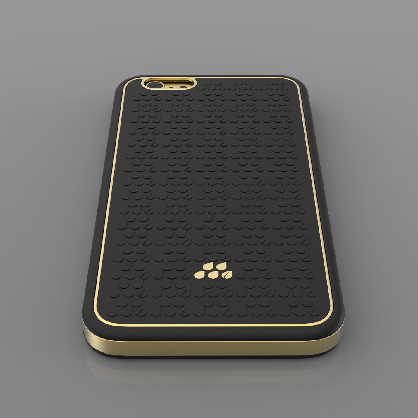
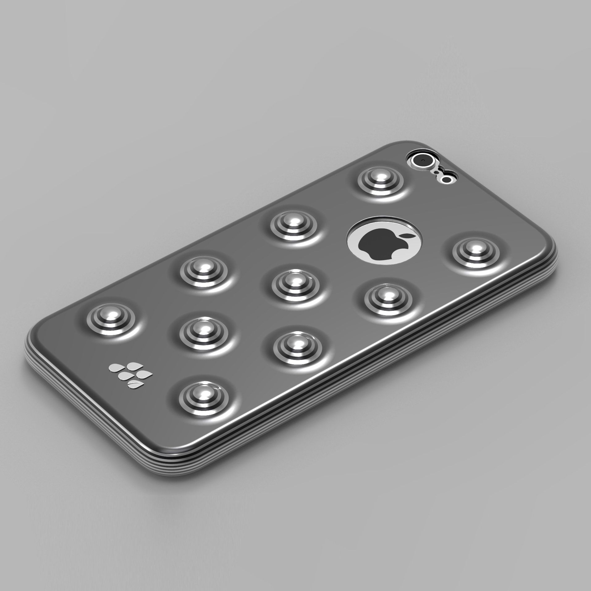
Smartphone Cover 1
Design by Luigi Trenti, 2015
For Evutec®, 2015
Evutec® is a famous Chinese manufacturer of covers for smartphones.
Its website description reads: Evutec® Corporation is the world’s first company to introduce and market protective products made from advanced, composite and recyclable materials. A feat which no other company has ever been able to offer...until now. By uniting ecology with technology we produce some of the thinnest, lightest and most protective cases for your consumer electronic products. Our quality control standards and rigorous testing allow us to deliver a product that will hold up with the changing times.
Our Evutec® Karbon series cases are made with DuPont™ Kevlar® woven fibers. DuPont™ Kevlar® is 5 times stronger than steel at the same weight. These cases are sleek, light, durable and impressive in design. Our Evutec® Wood series is the best option for those who love the feel of natural materials. These cases are a combination of real wood veneer fused with DuPont™ Kevlar® and still only 0.9mm thin.
All of our products are exceptionally strong, impressively thin and lightweight . Our Evutec® cases do not contain metal properties and will not reduce your GPS, WiFi or cellular signal. As you demand more from your smart devices, shouldn't you also demand more from your protective products? Here at Evutec® we think so and strive to make the thinnest, lightest and most durable cases.
For this company, I have designed a few proposed iPhone 6 smartphone covers.
Smartphone Cover 2
Design by Luigi Trenti, 2015
For Evutec®, 2015
Evutec® is a famous Chinese manufacturer of covers for smartphones.
Its website description reads: Evutec® Corporation is the world’s first company to introduce and market protective products made from advanced, composite and recyclable materials. A feat which no other company has ever been able to offer...until now. By uniting ecology with technology we produce some of the thinnest, lightest and most protective cases for your consumer electronic products. Our quality control standards and rigorous testing allow us to deliver a product that will hold up with the changing times.
Our Evutec® Karbon series cases are made with DuPont™ Kevlar® woven fibers. DuPont™ Kevlar® is 5 times stronger than steel at the same weight. These cases are sleek, light, durable and impressive in design. Our Evutec® Wood series is the best option for those who love the feel of natural materials. These cases are a combination of real wood veneer fused with DuPont™ Kevlar® and still only 0.9mm thin.
All of our products are exceptionally strong, impressively thin and lightweight . Our Evutec® cases do not contain metal properties and will not reduce your GPS, WiFi or cellular signal. As you demand more from your smart devices, shouldn't you also demand more from your protective products? Here at Evutec® we think so and strive to make the thinnest, lightest and most durable cases.
For this company, I have designed a few proposed iPhone 6 smartphone covers.
Smartphone Cover 3
Design by Luigi Trenti, 2015
For Evutec®, 2015
Evutec® is a famous Chinese manufacturer of covers for smartphones.
Its website description reads: Evutec® Corporation is the world’s first company to introduce and market protective products made from advanced, composite and recyclable materials. A feat which no other company has ever been able to offer...until now. By uniting ecology with technology we produce some of the thinnest, lightest and most protective cases for your consumer electronic products. Our quality control standards and rigorous testing allow us to deliver a product that will hold up with the changing times.
Our Evutec® Karbon series cases are made with DuPont™ Kevlar® woven fibers. DuPont™ Kevlar® is 5 times stronger than steel at the same weight. These cases are sleek, light, durable and impressive in design. Our Evutec® Wood series is the best option for those who love the feel of natural materials. These cases are a combination of real wood veneer fused with DuPont™ Kevlar® and still only 0.9mm thin.
All of our products are exceptionally strong, impressively thin and lightweight . Our Evutec® cases do not contain metal properties and will not reduce your GPS, WiFi or cellular signal. As you demand more from your smart devices, shouldn't you also demand more from your protective products? Here at Evutec® we think so and strive to make the thinnest, lightest and most durable cases.
For this company, I have designed a few proposed iPhone 6 smartphone covers.
Cufflinks
Design by Luigi Trenti, 2008
For Piquadro, 2008
With Piquadro, we started with the idea of developing pens, but we ended up
designing and producing cufflinks.
The collections of leather goods of this prestigious brand impressed me for the careful design research: each product reveals content and functionality.
A significant feature is also expressed by the design quality of all metal parts that have inspired the design of this first collection of cufflinks Piquadro.
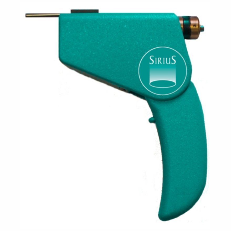
Nexus
Design by Luigi Trenti, 1999
For Sirius, 2000
This is the handpiece that was used for the first integrated system of control of laser-tissue interactions in the various medical applications that was born from the need expressed by every laser operator to prevent harmful energy overdoses.
The handpiece was equipped with a handle with adjustable inclination, equipped with laser, photometer, thermometer and cold air outlet at -30°C, connected to the cooling generator with built-in computer.
It was realized in small series through 3D printing with SLS technology.
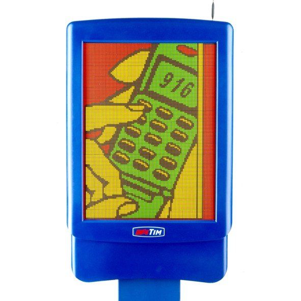
MFT192GSM
Design by Luigi Trenti, 1998
For TIM, 1998
Produced by Ciemme Sistemi on order of TIM and later used also by San Paolo IMI, ENEL, Alitalia, Poste Italiane, EuropCar and remotely upgradeable via GSM modem, it was a display with a colored LED screen with high brightness and wide field of visibility.
The updating of the message is done with the preparation of schedules aimed at achieving the intended objective, using a special software.
Through this tool it is possible to retain the customer at the time when he is more receptive, communicating what the imagination of the marketing service can imagine to make stronger the bond between the company and the customer.
It was conceived at a time when the big screens as we know them today were technologically unthinkable.
The screen was made by placing hundreds of small elements on electronic boards. A revolutionary and complex object to realize.
Strengthened by this technology and the well-groomed design, suitable for placement in numerous telephone outlets, Ciemme Sistemi was able to sell a thousand of them to TIM immediately, achieving a millionaire turnover.
MFT192GSM was selected for the SMAU Award in Milan.
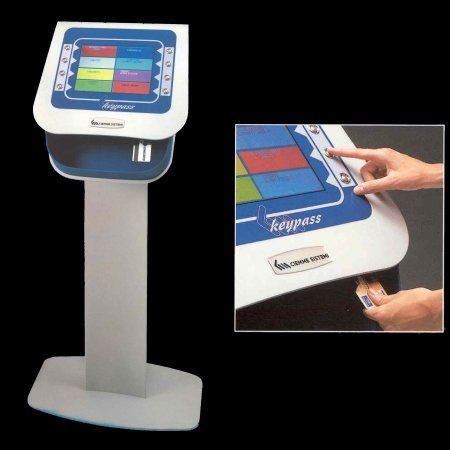
Keypass
Design by Luigi Trenti, 1999
For Ciemme Sistemi, 1999
Keypass was the technological answer that everyone was waiting for in order to solve the problems related to the booking of services and the control of queues in banks, public administrations and healthcare institutions.
Keypass was a modular system that, by means of a newly designed hardware and its own Winges software, was able to be installed in all operating systems and computer networks, simplifying its implementation to the maximum.
With its badge reader (Bancomat, Health Card, Fiscal Card) it allowed the immediate recognition of the user with a great saving of time of the personnel in charge of the management of the Service.
CONTACT US
Contattaci
Thank you for contacting us.
We will get back to you as soon as possible
An error occurred while sending the message.
Please try again later